10 Best Landing Page Design Patterns for B2B Tech in 2026
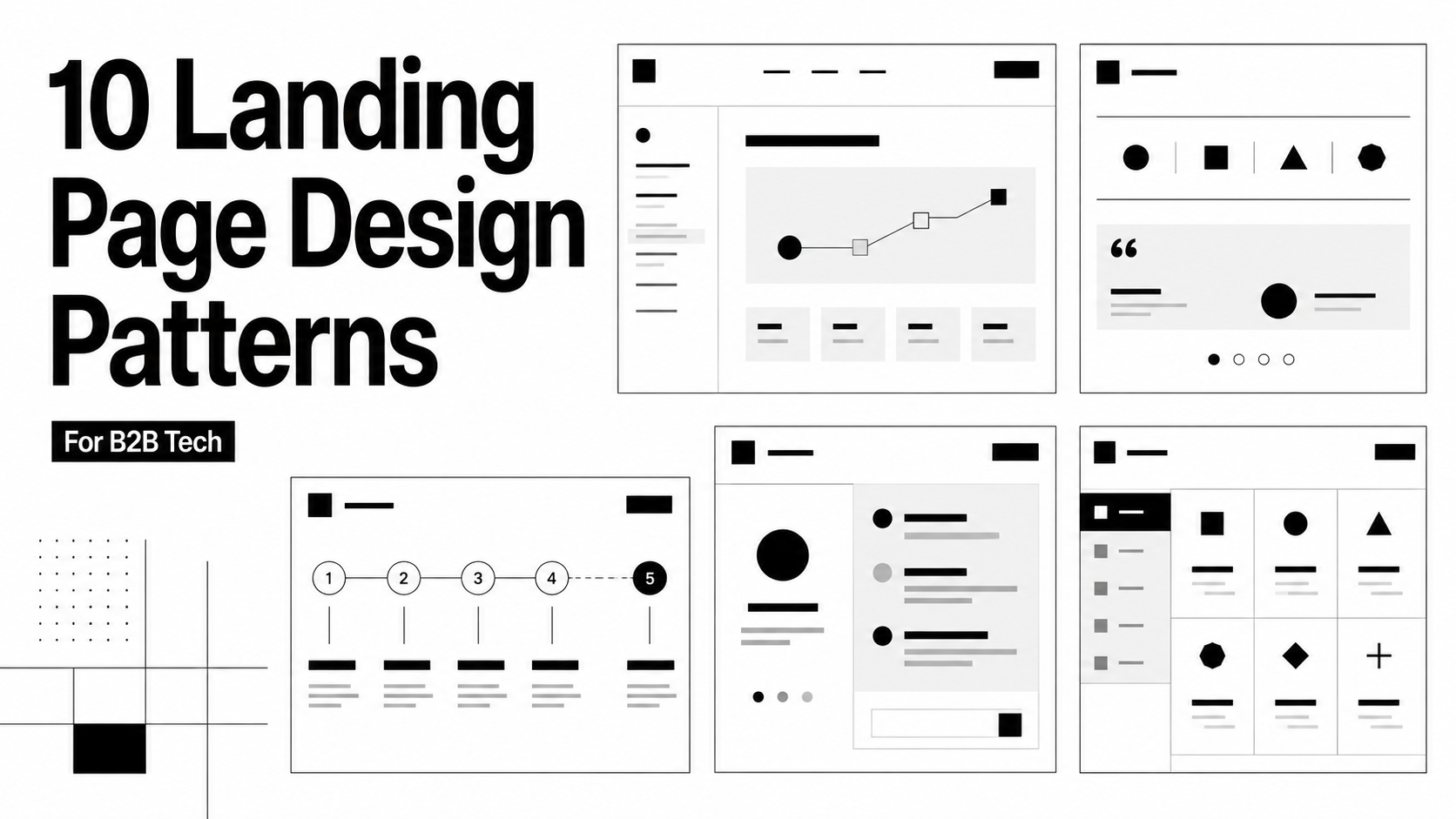
A landing page has a difficult job.
Someone may arrive from an ad, search result, LinkedIn post, outbound email or sales conversation. They probably know less about your product than your team thinks they do. And within a few seconds, the page needs to answer several questions:
Am I in the right place?
Is this relevant to me?
What exactly does this product do?
Why should I believe you?
What should I do next?
That is why the best landing page designs are rarely just the most visually impressive ones.
They make the product easier to understand. They create a clear path through the page. They put proof where skepticism naturally appears. And they make the next step feel obvious rather than forced.
For B2B technology companies, there is another challenge. The product itself may be complicated. The landing page needs to simplify the story without making the product feel simplistic.
Here are ten landing page design patterns worth studying, and what to borrow from each.
Before looking at examples: what should a good landing page actually do?
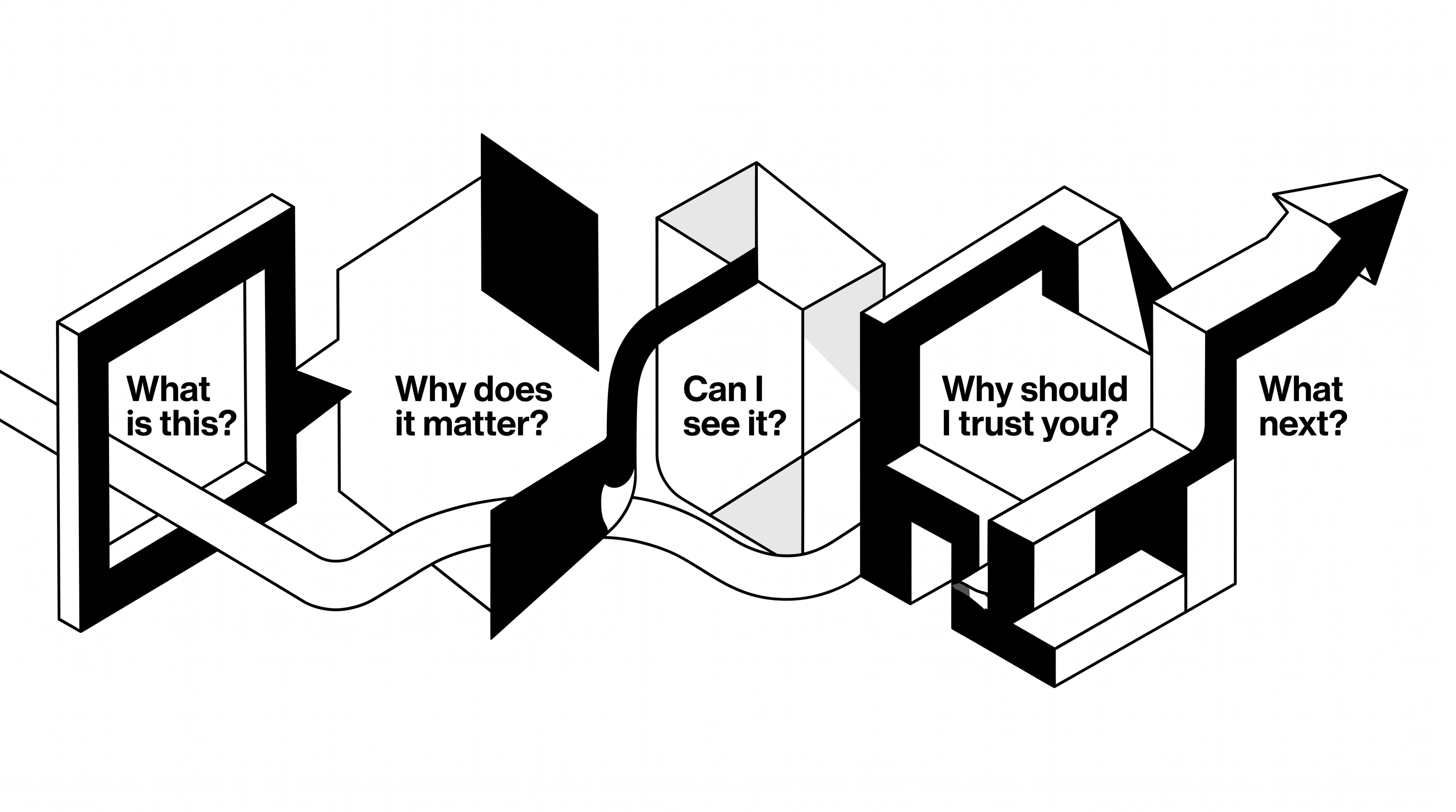
A useful landing page should answer five questions.
1. What is this?
A visitor should understand the basic offer quickly. Not every detail. Not every feature. Just enough to know whether continuing is worth their time.
2. Why does it matter?
Features make more sense once the buyer understands the outcome they create.
"AI-powered orchestration" may describe your technology. "Resolve support requests without adding another queue" tells the buyer why it matters.
3. Can I see it?
B2B technology pages often spend too much time describing software that would be easier to understand if they simply showed it.
Screenshots, workflows, interactive demonstrations, diagrams and before and after states can often explain more than another paragraph.
4. Why should I trust you?
Proof can take many forms. Customer logos, testimonials, case studies, product screenshots, security signals, quantifiable results, integrations and technical detail all qualify.
The right proof depends on what the buyer is worried about.
5. What happens next?
A landing page should have a dominant next action.
That does not mean placing the same button every few hundred pixels without thought. It means creating enough understanding and confidence that the action feels like the natural next step.
With those principles in mind, here are ten landing page structures that work particularly well for B2B technology products.
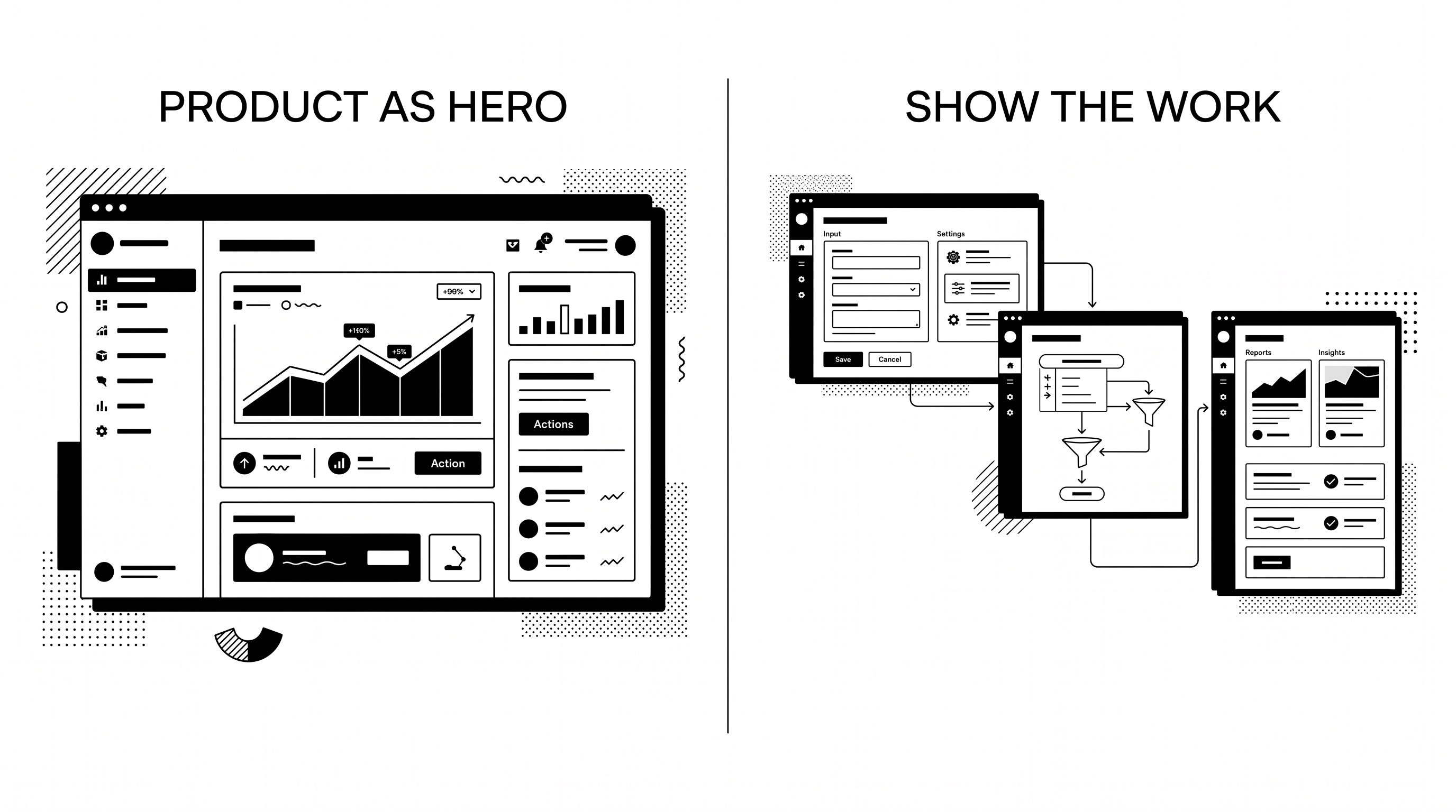
1. The product-as-hero landing page
Some products become easier to sell the moment someone sees them.
If that is true for yours, do not hide the product halfway down the page. Make it the hero.
A product-led landing page can use a large interface preview immediately below or beside the main value proposition. The visitor understands both the promise and what fulfilling that promise actually looks like.
The strongest versions do not simply drop a screenshot into a laptop frame. They direct attention.
A browser window can zoom into an important workflow. Tabs can demonstrate different use cases. A subtle animation can show a task moving from input to result. An interactive demo can let the visitor explore without committing to a sales call.
What to borrow
Show the part of the product that proves the headline.
If the hero says your platform simplifies a workflow, the accompanying visual should show that workflow becoming simpler. Do not use a dashboard merely because dashboards look like software.
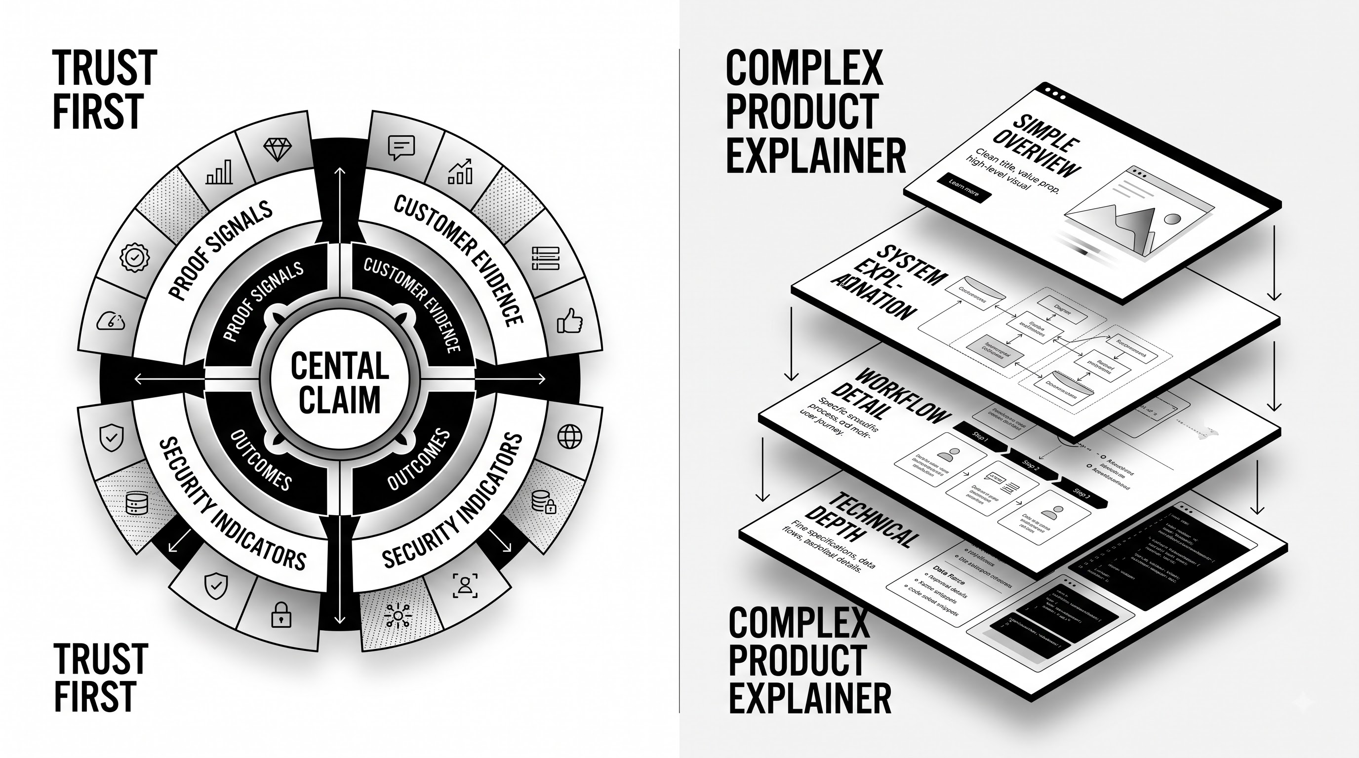
2. The trust-first landing page
Some buyers need confidence before they need excitement.
That is particularly true when the product touches financial data, healthcare, infrastructure, security, compliance or other business-critical systems.
In those situations, trust cannot be buried near the footer.
A trust-first page usually keeps the hero simple. Clear positioning. One primary action. Recognizable customer or partner proof.
Then the page quickly reinforces that promise with testimonials, outcomes, security information or implementation evidence.
The design itself should help. Clean typography, disciplined spacing and strong hierarchy often communicate maturity better than excessive animation.
What to borrow
Move the proof closer to the claim.
If you say teams trust the product with a critical business process, show evidence next to that statement rather than six sections later. A good landing page does not ask visitors to remember unsupported claims while they scroll.
3. The complex-product explainer
Technical products face a difficult balance.
Explain too little and the product feels vague. Explain everything and the page becomes documentation.
A strong technical landing page creates levels of understanding.
The hero establishes the problem and outcome. The next section shows how the system works at a high level. Later sections allow interested buyers to go deeper into workflows, architecture, integrations or individual capabilities.
Visuals carry much of the load. Process diagrams, product screens and simple flows can turn something conceptually dense into something a buyer can follow.
What to borrow
Simplify the explanation, not the product.
Technical buyers do not need everything stripped down to three generic benefit cards. They need a clear mental model first, and enough detail afterward to verify that model.
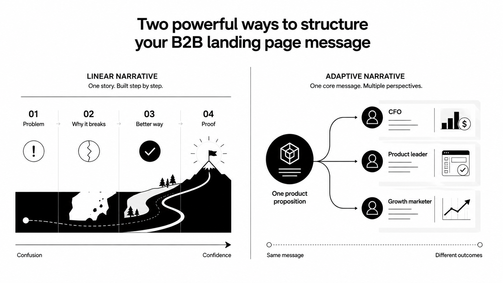
4. The problem, solution and proof landing page
Sometimes the product only makes sense once the buyer recognizes the problem.
This structure works particularly well when a company is addressing fragmented workflows, disconnected tools, inefficient processes or a relatively new category.
The page progresses almost like an argument.
Here is what is happening now.
Then: here is why the existing approach breaks down.
Then: here is a better way to do it.
The product enters once the reader understands the context. From there, proof demonstrates that the solution works outside the marketing page.
This creates a narrative rather than a collection of sections.
What to borrow
Design the scroll around the buyer's changing understanding.
Do not begin with your internal product architecture if the visitor has not yet understood why the problem matters. Sequence matters.
5. The persona-specific landing page
A CFO, product leader and growth marketer can all buy the same platform for completely different reasons.
Sending all three to identical messaging creates unnecessary work for the buyer.
A persona-specific landing page changes more than the headline. It should adapt the problem being emphasized, the outcomes, the examples, the product views, the proof, the integrations and potentially even the CTA.
An industry-specific page should work similarly. A generic product claim becomes much stronger when the examples and proof clearly belong to the visitor's world.
What to borrow
Match the landing page to the intent that brought the visitor there.
If someone clicks an ad about a specific use case, dropping them onto a generic homepage forces them to start the search again. Continue the conversation instead.
6. The show the work landing page
For collaborative, visual or workflow products, the interface itself can become the page's strongest storytelling device.
Rather than separating the marketing website and the product demo, the landing experience starts to resemble using the product.
Large product canvases can show comments appearing. Team members can move through stages. A workflow can develop as the visitor scrolls. Multiple product views can reveal how different roles participate in the same process.
The experience helps visitors imagine themselves doing the work.
What to borrow
Demonstrate behavior, not just features.
A static screenshot can show what a product contains. A carefully designed sequence can show what happens when someone actually uses it.
That difference matters.
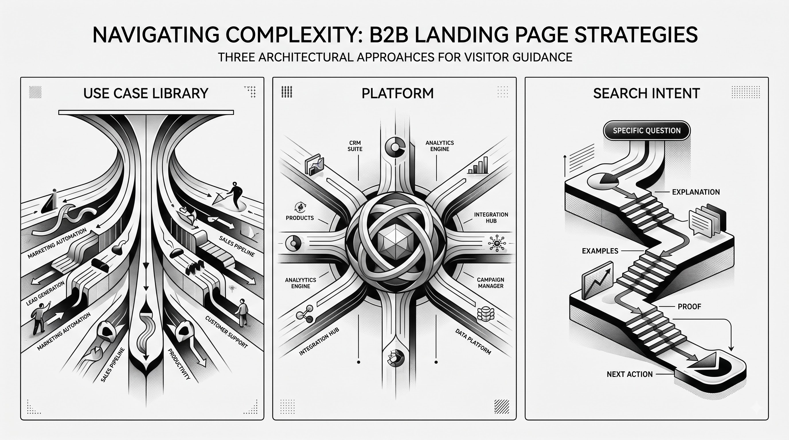
7. The use-case library landing page
Some products do many things.
Trying to explain all of them sequentially can create an enormous page with no obvious priority.
A use-case or template-led design gives the visitor control. The page establishes the broad value proposition, then presents recognizable starting points such as lead management, customer onboarding, reporting, research, campaign planning and internal operations.
Selecting one reveals a relevant workflow, template or product state.
This works because buyers rarely arrive wanting software. They arrive wanting to accomplish something.
What to borrow
Organize around jobs buyers recognize, not only product modules.
Your navigation may call something "Workflow Studio." Your buyer may simply be trying to automate lead follow-up. Their language is usually the better landing-page language.
8. The human-led landing page
Not every technology landing page needs to look entirely like technology.
When the value of the product is communication, collaboration, advisory support or a human experience enabled by software, showing people can make the page significantly easier to relate to.
The important distinction is between human imagery with a job and generic stock photography.
A person's face inside a product workflow makes sense for video communication software. A customer interacting with a real product makes sense. A founder explaining a difficult concept on video can work. A group of smiling people pointing at a laptop usually says very little.
What to borrow
Use people when people are part of the value.
Do not add human imagery simply because the page feels visually empty.
9. The platform landing page
A single-product page can lead visitors down one clear path.
A platform has a harder problem. Different buyers may care about entirely different parts of the product.
The solution is not to explain everything in the hero.
A strong platform page establishes the unifying value proposition first. Then it provides clear entry points into individual products, capabilities or use cases. The visitor can self-select.
Good visual hierarchy is especially important here. Product cards need enough differentiation to be useful without making the platform feel like a collection of unrelated tools.
What to borrow
Give people multiple paths without giving them multiple competing stories.
The platform needs one reason to exist. The modules underneath it can serve different reasons for visiting.
10. The search-intent landing page
Some of the highest-value landing pages do not begin with a campaign. They begin with a question.
A buyer searches for a problem, category, use case or comparison and arrives on a page specifically designed around that intent.
These pages need more substance than a typical paid-campaign landing page. The visitor may need a clear definition, a practical explanation, product context, examples, FAQs, proof, technical details and a route into deeper content.
The page can still convert, but it earns that conversion by first being genuinely useful.
This becomes even more important as buyers use both search engines and AI-assisted discovery tools to research products and categories.
What to borrow
Design around the question the visitor is trying to answer.
Search visibility and conversion should not be treated as separate disciplines. A page that earns the visit but fails to move the buyer forward is incomplete. So is a conversion-focused page that nobody can discover.

The best landing pages are designed as arguments
Look across these ten patterns and the visual styles vary dramatically. The underlying logic does not.
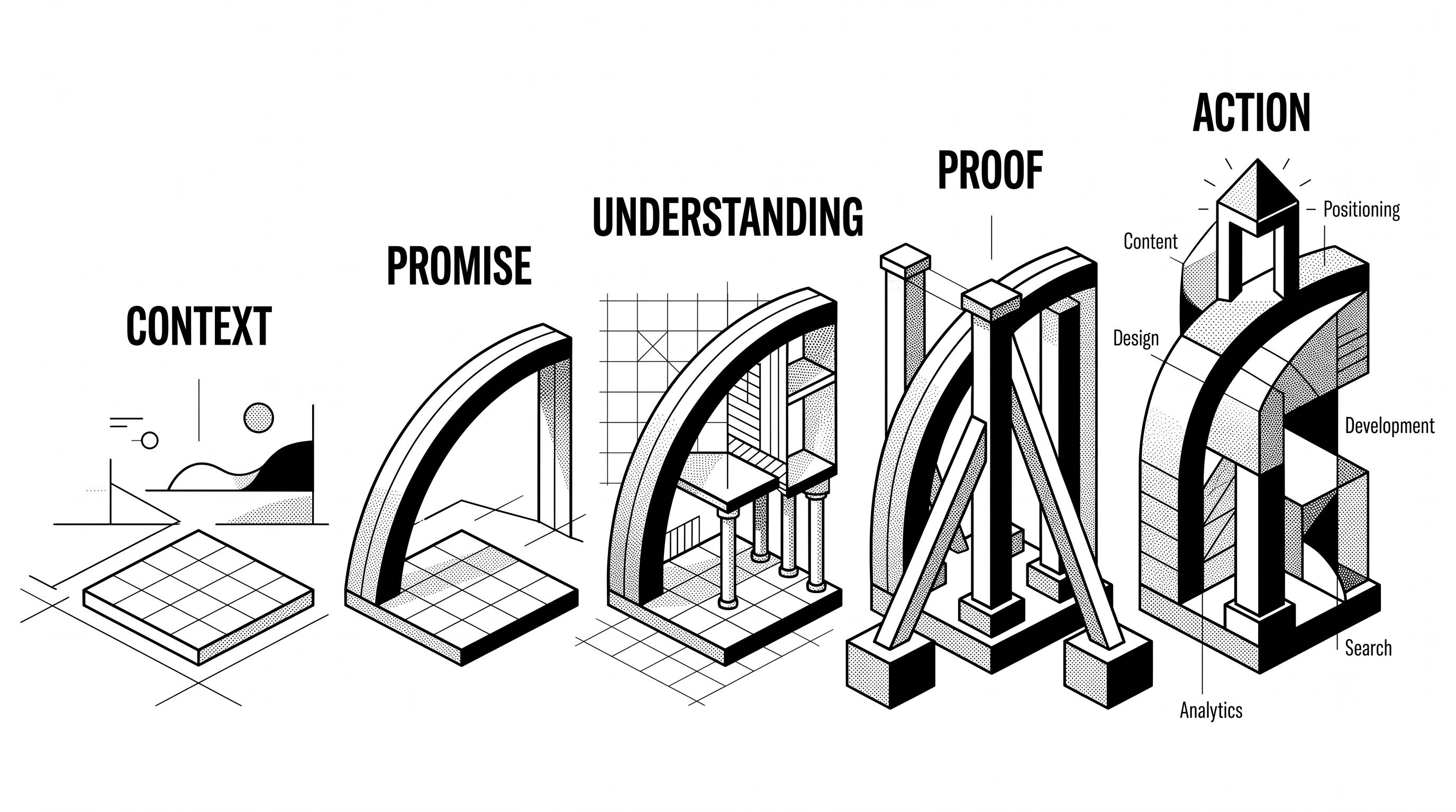
A strong landing page normally moves through some version of context, promise, understanding, proof and action.
Not necessarily in five neat blocks. Not necessarily in that exact order. But the reader should feel their questions being answered as they move through the page.
This is where landing-page design becomes more than arranging sections.
The positioning determines what the page needs to say. Content determines the argument. Design determines what gets noticed and understood. Development determines whether the experience works properly across screens. Search influences how relevant buyers discover it. Analytics and iteration reveal where the experience needs to improve.
That is why Envizn approaches websites as business and growth assets rather than collections of finished screens.
A practical landing page checklist
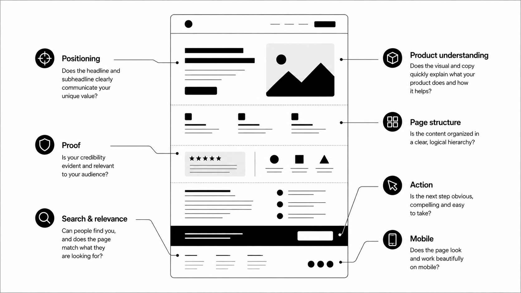
Before publishing your next landing page, check it against these questions.
Positioning
Can a first-time visitor understand what you offer?
Is it obvious who the page is for?
Does the headline communicate something meaningful rather than category jargon?
Product understanding
Can visitors see the product or service in context?
Do visuals help explain the promise?
Have you shown the important workflow instead of just decorating the page?
Proof
Are important claims supported nearby?
Does the proof match the buyer you are targeting?
Are testimonials specific enough to be useful?
Page structure
Does each section answer a natural next question?
Can someone scanning the page understand the argument?
Have you removed sections that exist only because landing pages usually have them?
Action
Is one next step visually dominant?
Does the CTA match the visitor's likely level of intent?
Is there an appropriate lower-friction route for someone who needs more information?
Search and relevance
Does the page match the ad, query, email or content that brought the visitor there?
Is the language specific enough for relevant search and AI-assisted discovery?
Does the page contain enough useful information to stand on its own?
Mobile
Does the story still work when sections collapse vertically?
Are important product visuals understandable on a smaller screen?
Are forms, buttons and interactive elements comfortable to use?
Landing page inspiration only works when you know what to borrow
It is easy to save a gallery of beautiful landing pages. It is harder to understand why each one works.
That distinction matters.
A product-led page may work because the product is immediately understandable on screen. A trust-heavy page may work because its category demands reassurance. A template-led page may work because visitors arrive with many different jobs to complete.
Copying the surface treatment without understanding that logic is how landing pages become collections of fashionable sections.
Use inspiration differently.
Look at the job each section is doing. Look at the question it answers. Look at where proof appears. Look at what gets shown instead of explained.
Then build the page around the buying decision your company actually needs to support.
Your landing page should make the next decision easier
Envizn Labs works with ambitious B2B tech companies across positioning, content and design direction, web design, Webflow development, SEO and AEO, AI workflows and ongoing website growth.
The goal is not another attractive page.
It is a clearer, more useful path from "What is this?" to "This is worth exploring."
Let's talk growth.


Turn Your Vision into a Scalable Digital Experience
From brand to backend, we create systems and experiences that actually move the needle.
B2B Branding Strategies: 5 Ways to Build a Brand Buyers Remember
Webflow Website Maintenance: 7 Practices That Keep Your Site Working