Website Revamp Strategy: When Your B2B Website Needs More Than a Redesign
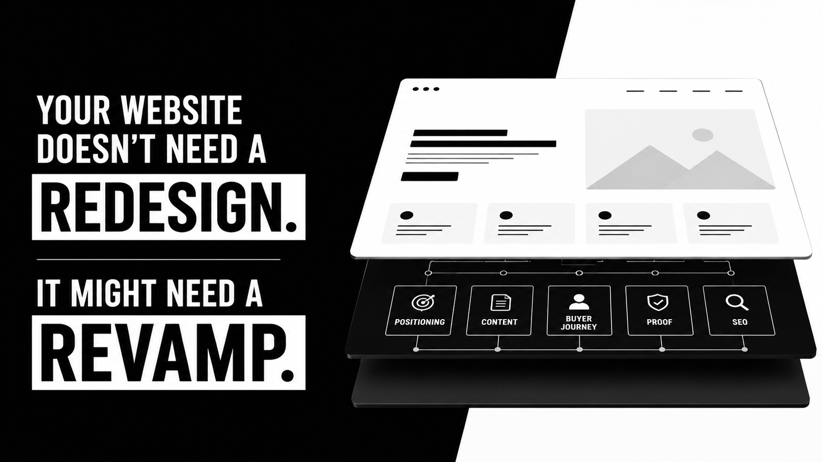
A website can look completely new and still leave the business with exactly the same Problem.
The product is still difficult to understand. The value proposition still sounds like everyone else’s. Buyers still struggle to find the proof they need. Sales still has to explain what the homepage couldn’t. Marketing still treats every new page like a small development project.
Only now, everything has nicer typography.
That is the danger of treating a website revamp as a design exercise.
For an ambitious B2B tech company, the website sits at the intersection of positioning, content, design, demand generation, search visibility, and the buyer journey. Changing the visual layer while ignoring everything underneath can make the site look different without making it meaningfully better.
So before asking:
“What should the new website look like?”
Ask a more useful question:
“What does the website need to do differently for the business?”
That question changes the entire project.
A website revamp is more than giving the site a new skin
“Website revamp” and “website redesign” are often used interchangeably.
The distinction matters.
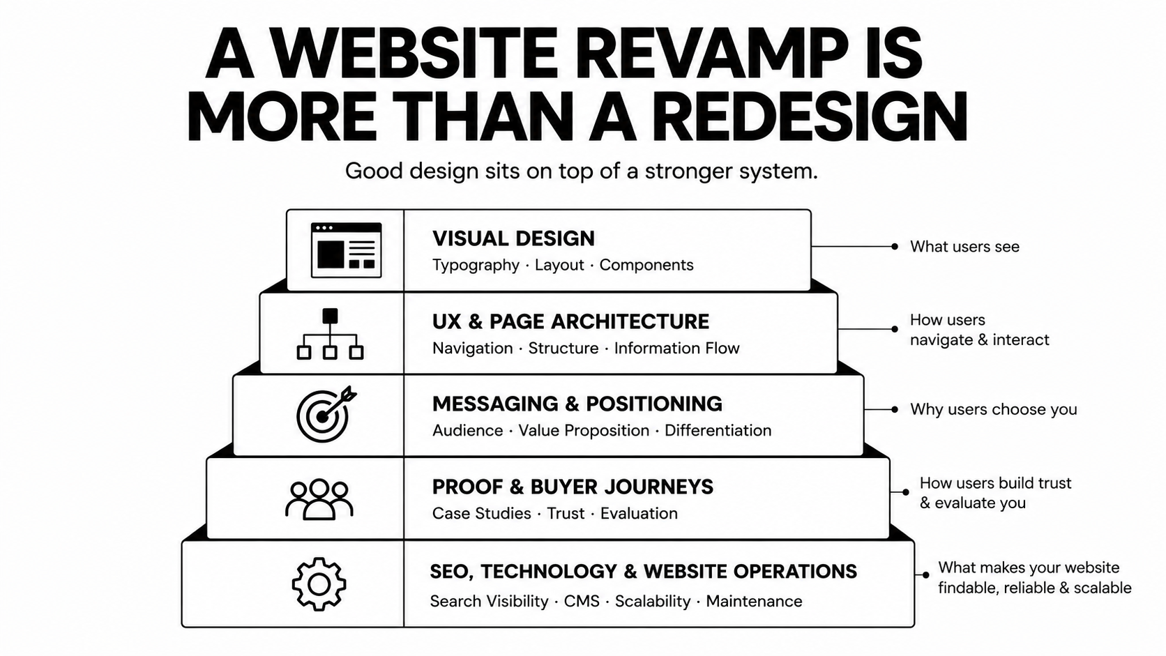
A redesign can be largely visual: new layouts, typography, illustrations, components, interactions, or brand treatments.
A strategic website revamp goes deeper.
It can challenge the positioning, page architecture, messaging, proof, buyer journeys, conversion paths, search foundations, and even the way the website is operated after launch.
For a B2B company, that difference is important because prospective buyers are not judging the homepage in isolation.
They are trying to answer questions.
What exactly do you do?
Is this relevant to a company like mine?
Why should I believe you?
How is this different from the alternatives?
Where can I see proof?
What should I look at next?
Can I trust this company enough to keep investigating?
Good visual design helps communicate the answers.
It cannot manufacture answers that do not exist.
If the problem is the story, new pixels won’t solve it.
The wrong reasons often produce the wrong website
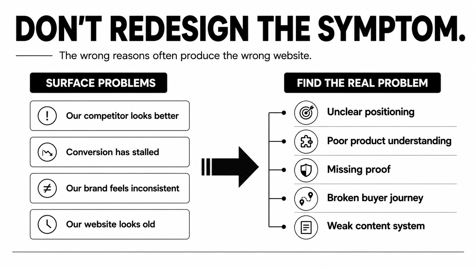
There are plenty of understandable reasons to start talking about a website revamp.
A new marketing leader wants to make an impact.
A competitor launches something sharper.
Conversion has stalled.
The brand feels inconsistent.
The existing website simply feels old.
Each can be a useful signal.
None is a diagnosis.
The better question is what that signal reveals about the business underneath the website.
“Our competitors look better than us.”
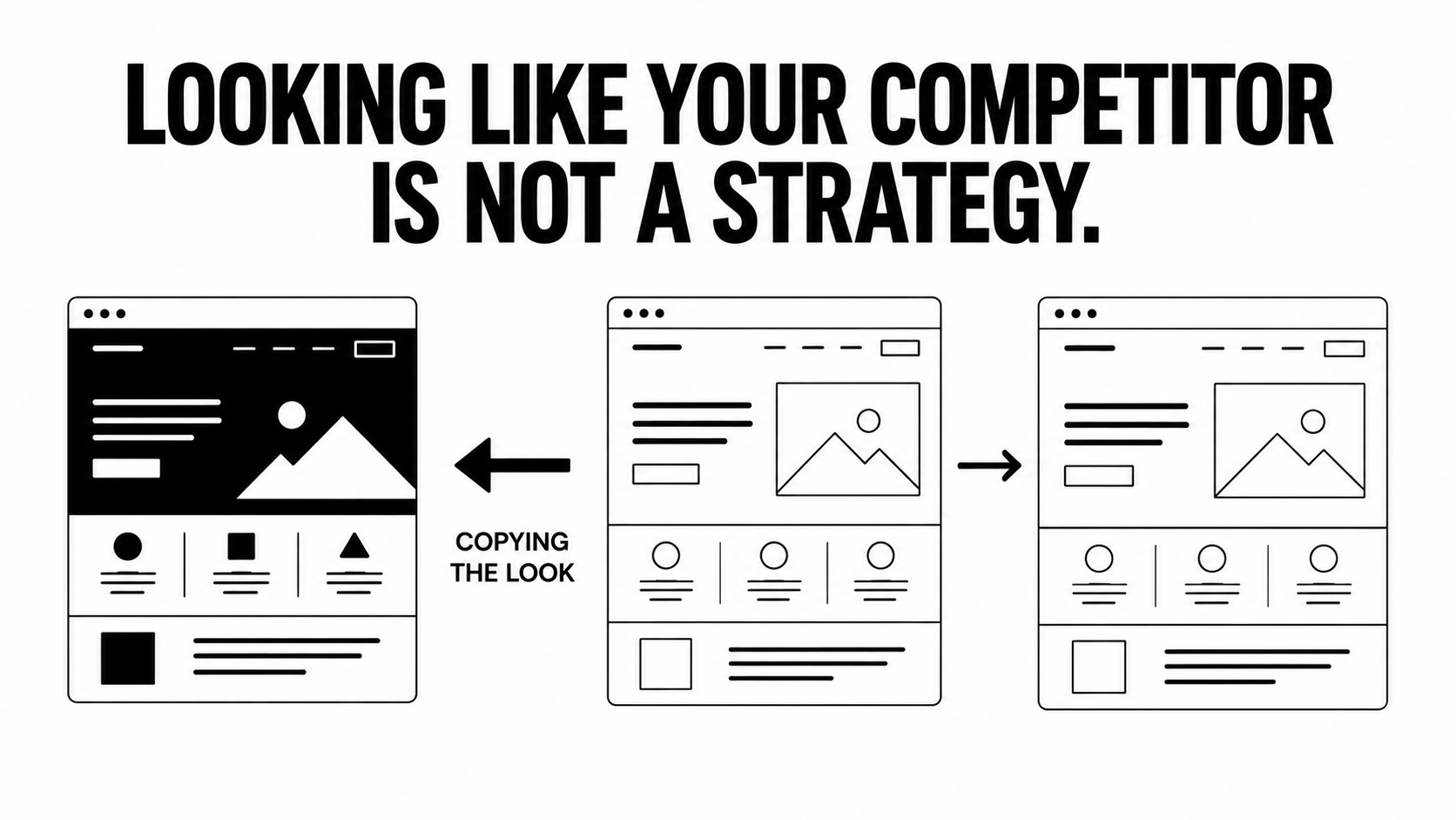
This is one of the fastest ways to start a redesign and one of the weakest ways to define one.
A competitor’s site reflects their product, positioning, audience, and internal priorities.
Following their visual direction too closely might make your company look more current. It can also make you less distinctive.
Instead, work out what triggered the reaction.
Did their site explain the category more clearly?
Was their product easier to understand?
Could you find relevant customer proof faster?
Did their company appear more established?
Was there a clearer journey from interest to evaluation?
Those are useful observations.
“We need animations like theirs” is not.
“We need better conversion.”
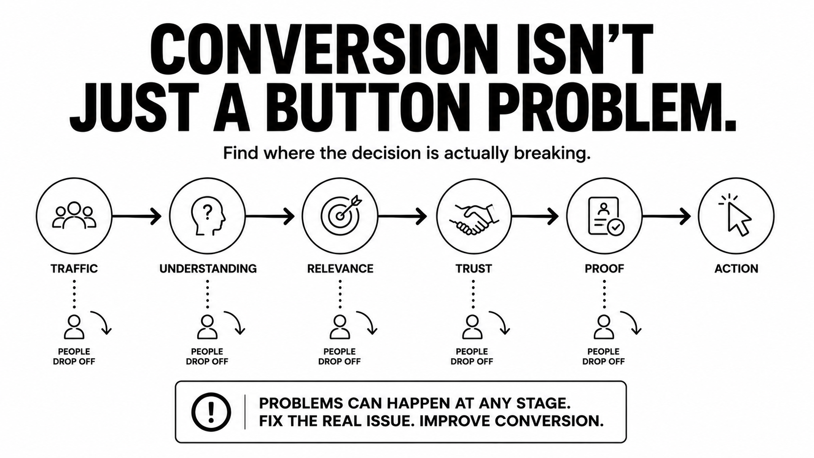
A redesigned website can remove friction from a conversion journey.
But conversion is rarely just a button problem.
If buyers do not understand the product, cannot see themselves in the messaging, distrust the claims, or cannot find enough evidence to continue, changing a CTA or polishing the interface will only go so far.
Before redesigning the page, work out where the decision is actually breaking.
Perhaps visitors reach the page but the positioning is unclear.
Perhaps qualified prospects read the homepage but cannot find technical detail.
Perhaps traffic arrives through search and lands on pages with no useful next step.
Perhaps the CTA asks for a sales conversation before the visitor has enough information to want one.
Design matters.
So does everything leading up to the click.
“Our brand feels inconsistent.”
That may be a design system problem.
It may also be a positioning problem.
When a company is unclear about what it stands for, who it serves, or why buyers should care, inconsistency eventually surfaces everywhere: the homepage, product pages, campaigns, sales decks, and brand identity.
A visual system can standardize how the company communicates.
It cannot decide what the company should communicate.
That work comes first.

Start with the job the website needs to perform
A stronger website revamp begins with diagnosis.
Before deciding on layouts, establish what the website must say, prove, and enable.
That starts with the business and its buyers.
What has changed since the existing website was created?
Has the product matured?
Has the company moved upmarket?
Are different buyers entering the sales process?
Has the category become more competitive?
Are prospects arriving through different search journeys?
Does the sales team repeatedly explain something that the website should already make clear?
The answers create a much better design brief than “make us feel more premium.”
At Envizn Labs, strategy and positioning inform the page plan, content direction, and eventual design rather than being treated as a layer added after the interface is already decided.
This does not make design less important.
It gives design a clearer job.
A practical framework before you revamp your website
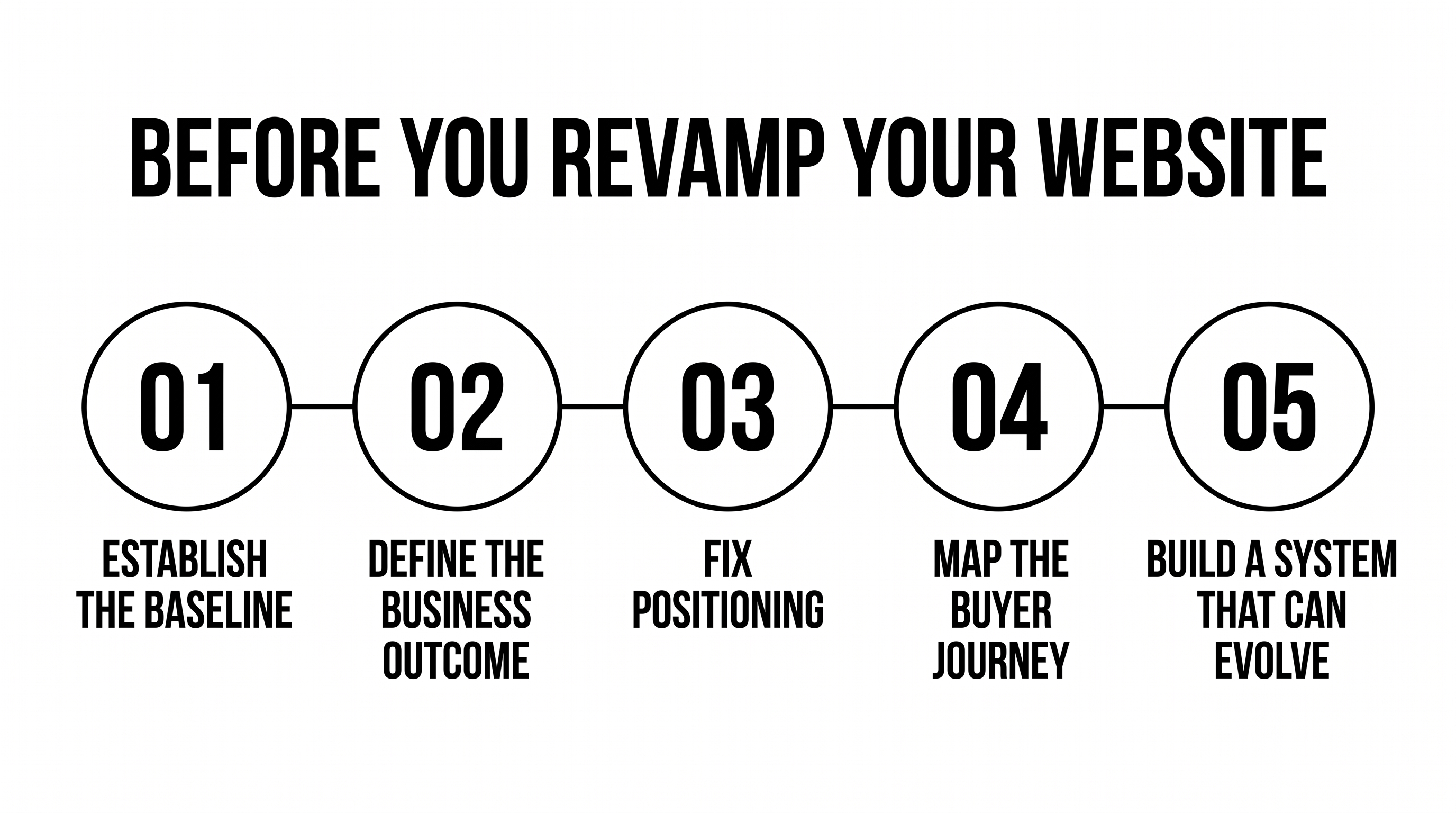
1. Establish the current baseline
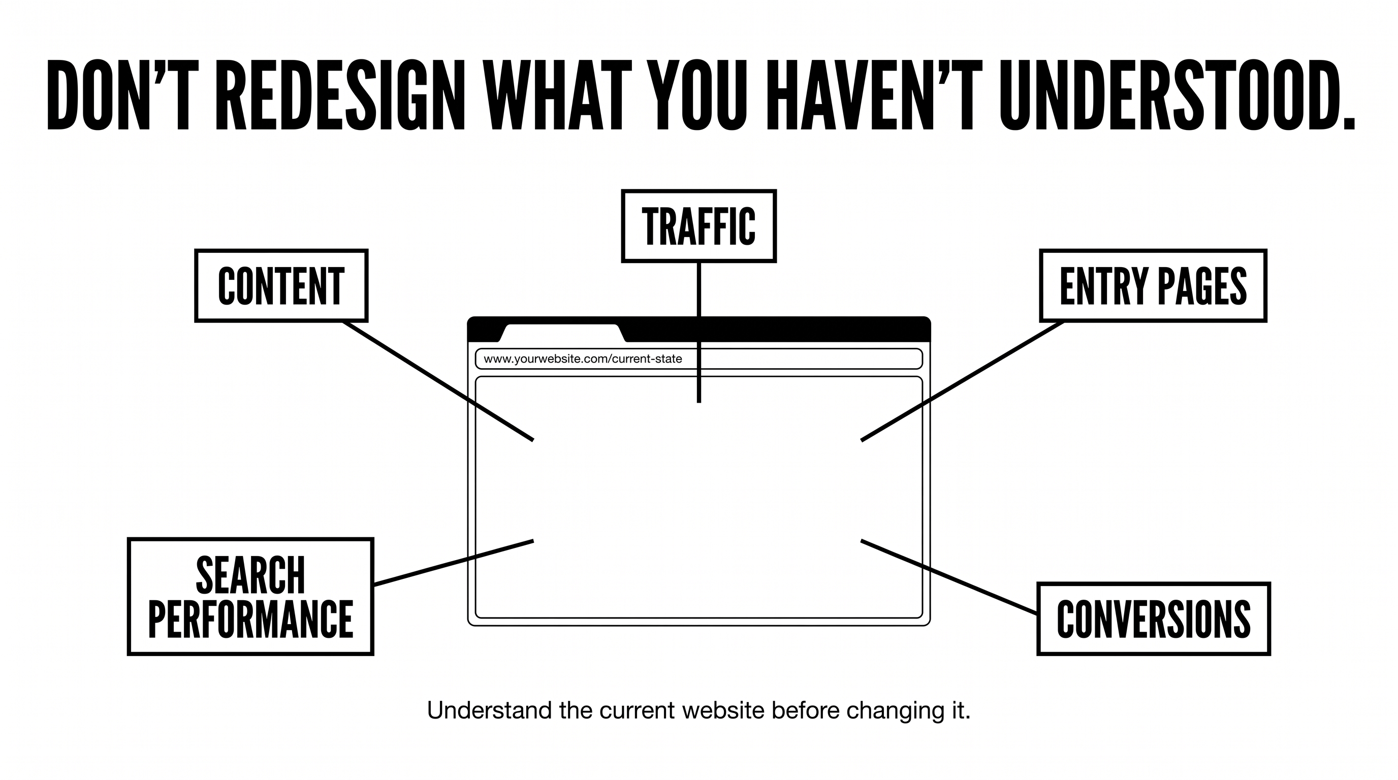
Do not redesign a website you have not understood.
Look at how the current site is actually performing.
Which pages attract relevant traffic?
Where do qualified visitors enter?
Which pages support sales conversations?
Where do visitors leave?
Which pages perform well in search?
What content does your sales team regularly send prospects?
Which pages are difficult for marketing to update?
The objective is not to collect every available metric.
It is to identify where the current website helps the business and where it gets in the way.
A page that looks dated but consistently attracts qualified search traffic may need careful improvement rather than deletion.
A beautiful page with no meaningful role in the buyer journey may deserve a much harder rethink.
The baseline gives those decisions context.
2. Define the business outcome
“Modernize the website” is not a useful objective.
Neither is “make it look more premium.”
A useful goal describes what should become different for the business or the buyer.
For example:
Make a complex product easier to understand.
Support a move into larger enterprise accounts.
Give sales stronger proof to use during evaluation.
Create a clearer path from search traffic to relevant product content.
Make it easier for marketing to publish new pages.
Improve how the company appears in both traditional and AI-assisted search.
When the objective is clear, you can judge design decisions against something more meaningful than preference.
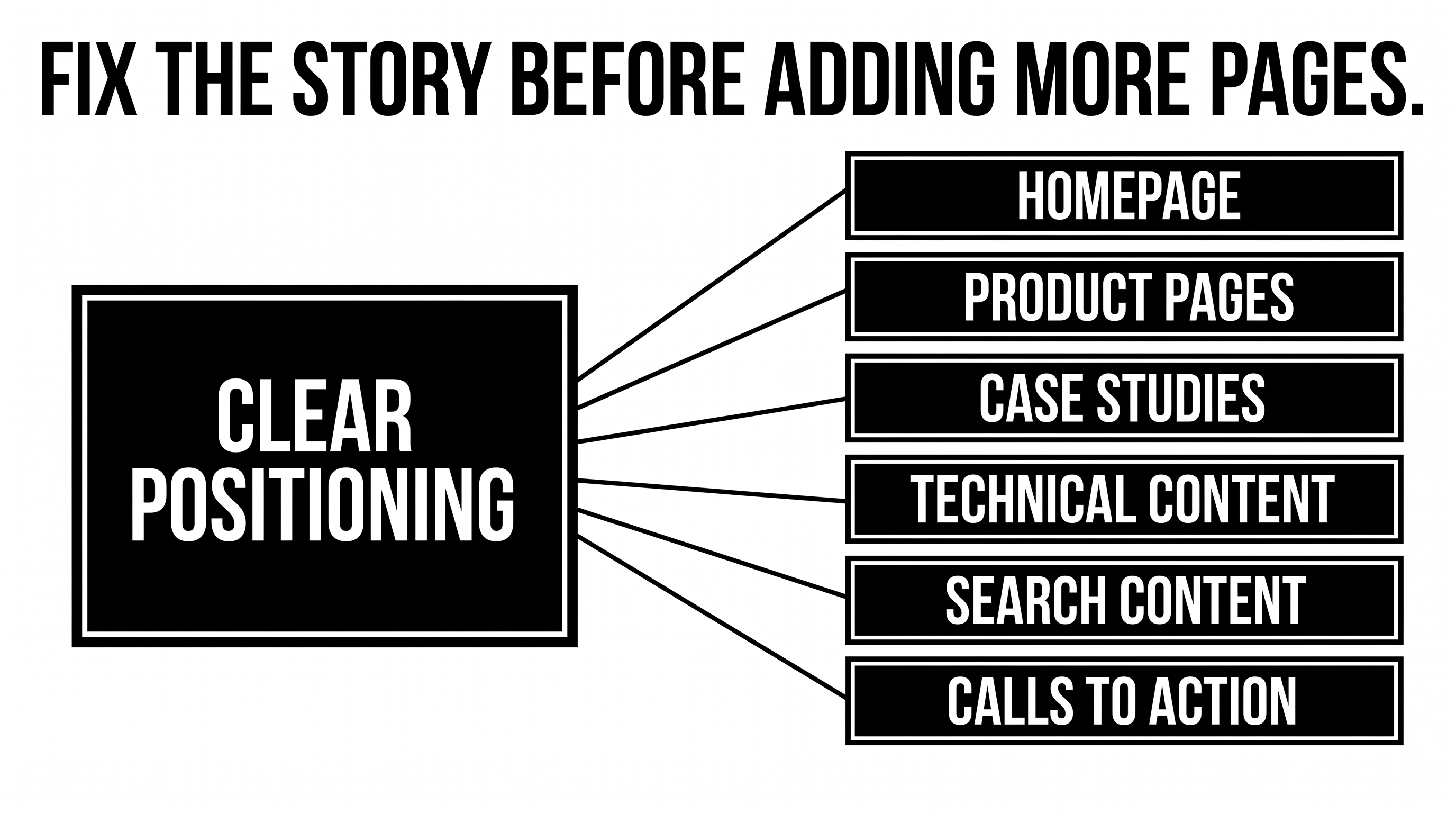
3. Fix positioning before multiplying pages
Before rewriting the homepage, establish the argument the website needs to make.
Who is it really for?
What problem is the company best positioned to solve?
Why is its approach different?
Which benefits actually matter to the buyer?
What proof makes those claims credible?
Without those answers, adding pages creates more places to repeat an unclear story.
With them, page architecture becomes far easier.
The homepage introduces the argument.
Product or service pages deepen it.
Case studies prove it.
Technical content answers evaluation questions.
Search content captures relevant demand.
Calls to action appear where the buyer has enough context to act.
The site begins working as one system rather than a collection of screens.
4. Map the buyer journey before designing the navigation
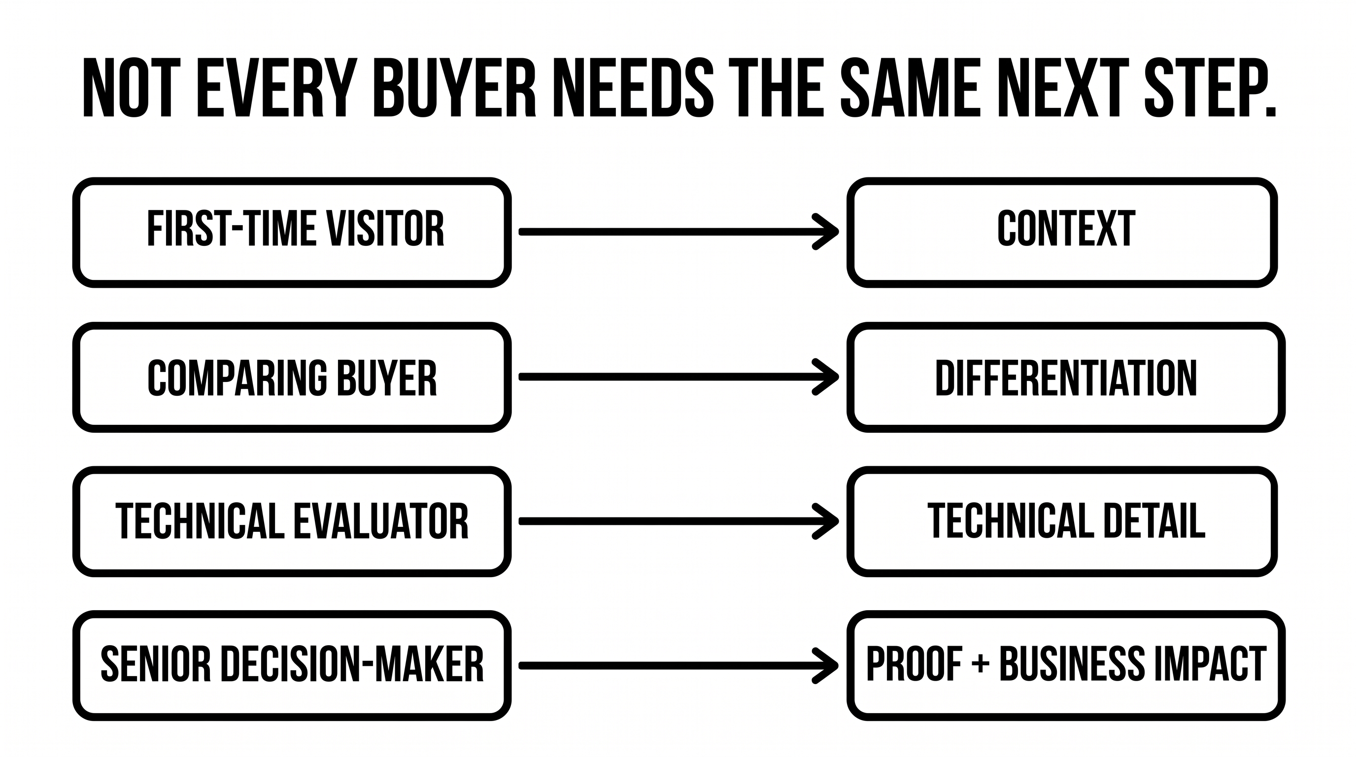
One of the easiest mistakes in B2B web design is assuming every visitor arrives with the same question.
They do not.
Someone discovering the company for the first time needs context.
A buyer comparing shortlisted options needs differentiation.
A technical evaluator wants detail.
A senior decision-maker may be looking primarily for confidence, proof, and business impact.
An existing prospect returning after a sales conversation may want a case study or technical answer rather than another “Book a demo” button.
A useful website gives each visitor somewhere intelligent to go next.
That means thinking about content and UX together.
What does this buyer need to understand first?
Which question comes next?
What objection could stop them?
What evidence would help?
Where does a case study carry more weight than another paragraph of marketing copy?
Where should technical depth appear?
When is the visitor actually ready for a conversation?
Those decisions shape effective website experiences far more than whatever visual trend happens to be popular this quarter.
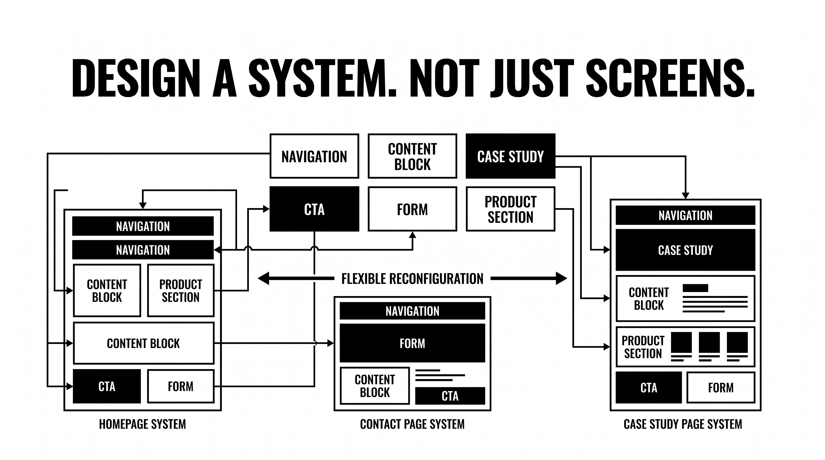
5. Design a system, not a collection of finished screens
The website will change after launch.
New campaigns will appear.
Products will evolve.
SEO pages will grow.
Case studies will be published.
Marketing will need landing pages.
New industries or use cases may become important.
If every change requires rebuilding the design logic from scratch, the website gradually becomes slower to operate and harder to keep consistent.
A revamp should therefore consider the system behind the finished screens.
Reusable components.
Flexible page structures.
A sensible CMS.
Clear content patterns.
Responsive behavior.
Defined interaction rules.
A framework the internal team can actually use.
The objective is not to predict every page the company will ever need.
It is to give the website enough structure to evolve without becoming a mess.
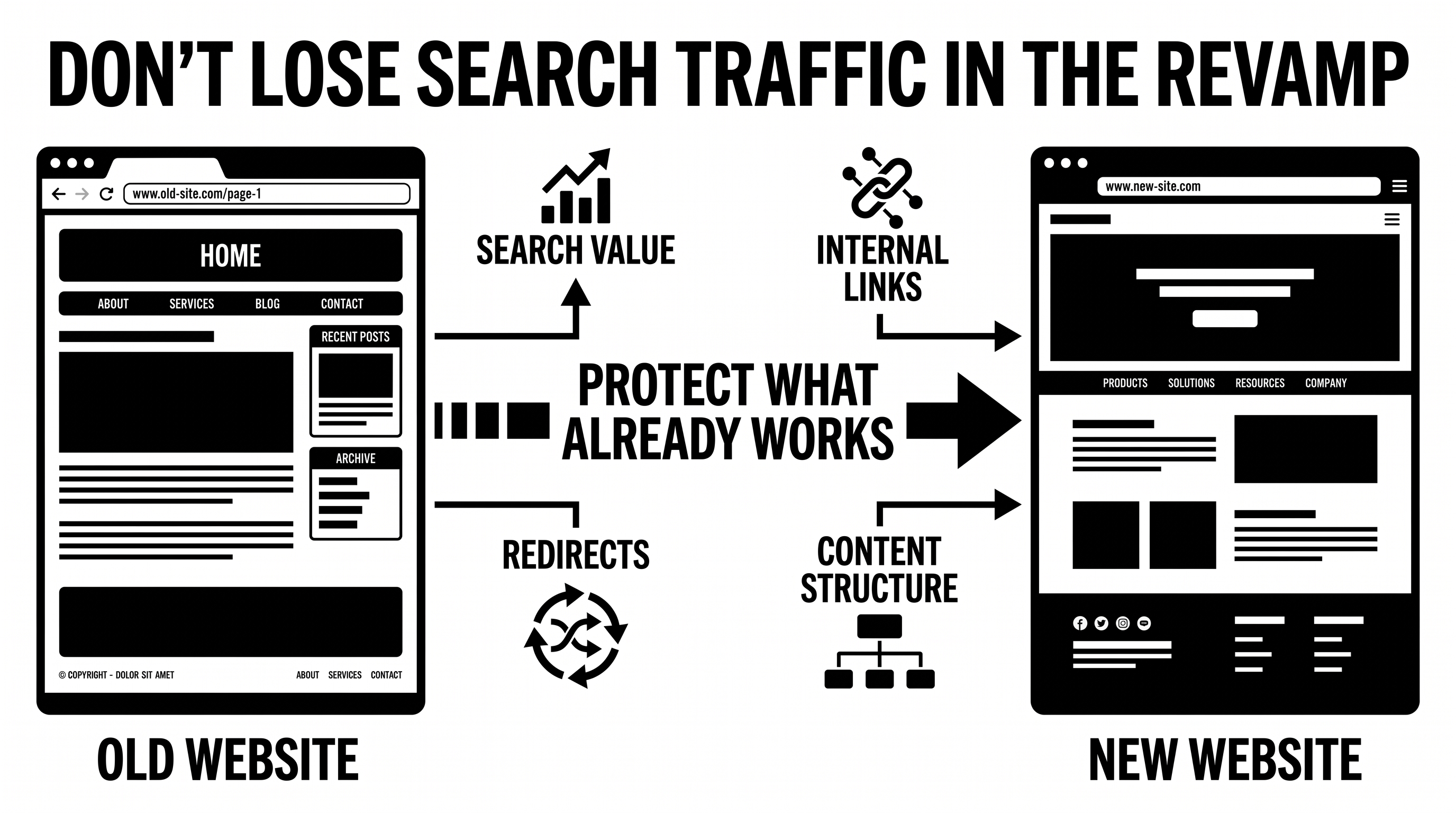
6. Protect search visibility while changing the site
A website revamp can alter URLs, content, navigation, internal links, page hierarchy, metadata, and technical architecture at the same time.
That makes search something to plan for during the revamp, not after it.
Understand which existing pages already carry search value.
Plan redirects when URLs change.
Maintain logical internal linking.
Make important content easy to crawl and understand.
Ensure pages answer specific questions rather than hiding essential information behind vague marketing language.
And increasingly, consider how clearly the site communicates its expertise to AI-assisted discovery experiences as well as traditional search engines.
SEO and AEO should influence the information architecture early enough to matter.
Adding them as a checklist immediately before launch is much less useful.
7. Do not let internal preference become the strategy
Website projects attract opinions.
Founders have opinions.
Marketing has opinions.
Sales has opinions.
Product has opinions.
Design has opinions.
That is not inherently a problem. Different teams understand different parts of the company and its customers.
The problem begins when preference replaces reasoning.
“I don’t like this section.”
“Can the logo be bigger?”
“It needs more movement.”
“Can we fit everything above the fold?”
“This doesn’t feel exciting enough.”
These comments are difficult to resolve because they have no shared reference point.
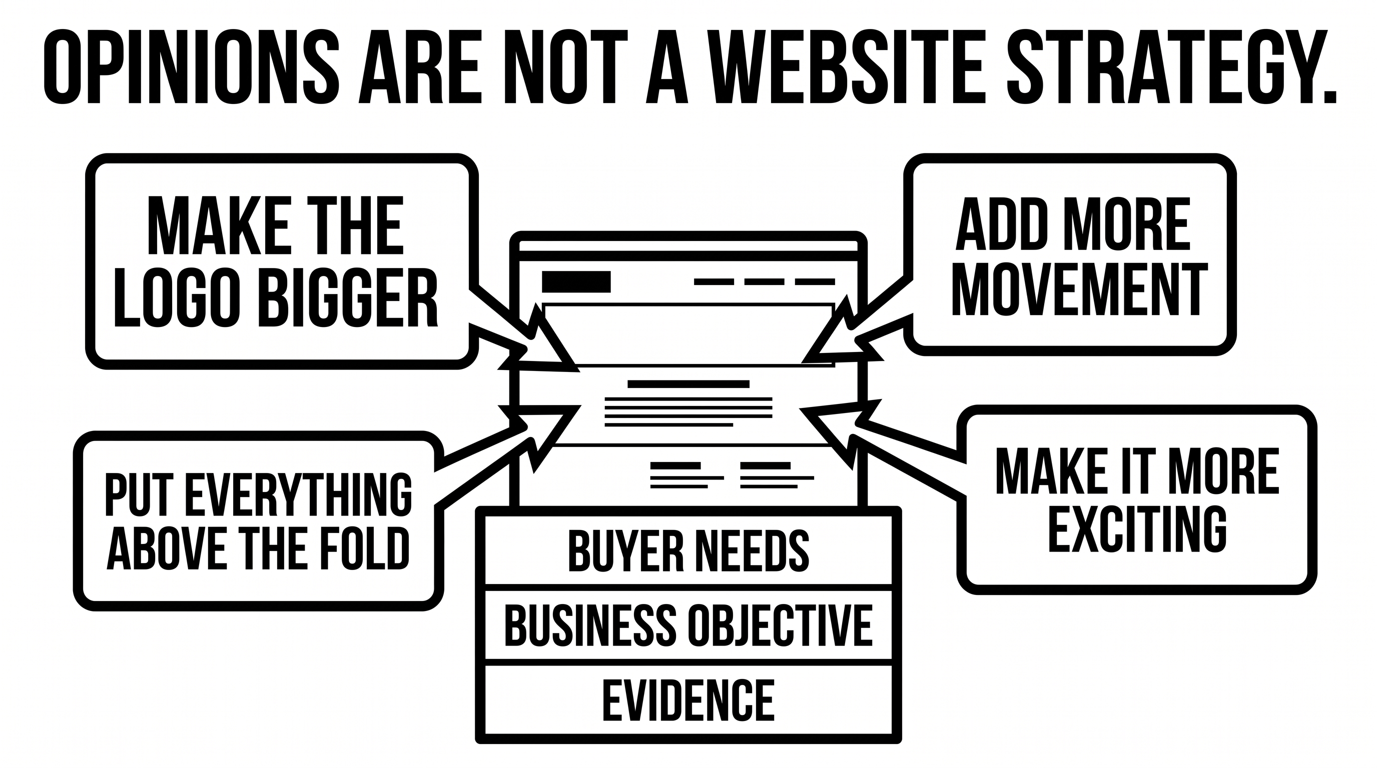
A stronger review process brings the discussion back to the buyer and the job of the page.
Does the change make the message clearer?
Does it strengthen the evidence?
Does the hierarchy make information easier to scan?
Does it help the right buyer find their next step?
Does it make the website easier or harder to maintain?
Once everyone is judging against the same objectives, feedback becomes considerably more useful.
8. Decide what happens after launch
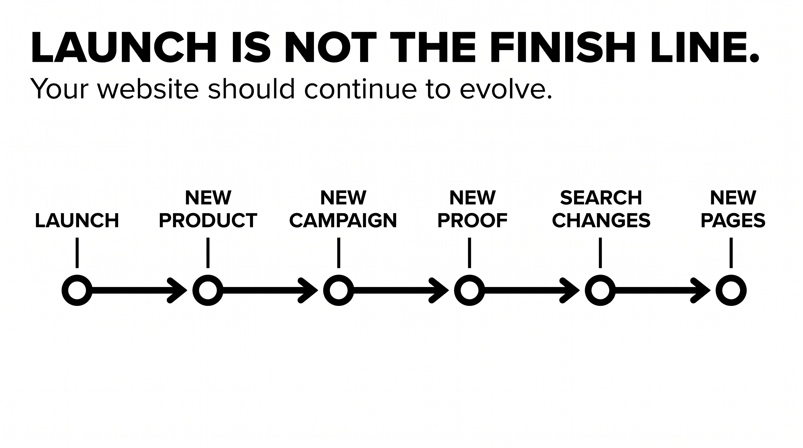
A website launch is a milestone.
It is not an operating model.
The business keeps changing after the website goes live.
Products change.
Buyer questions change.
Search behavior changes.
New proof becomes available.
Campaigns need new destinations.
Pages need maintaining.
Content opportunities emerge.
A website that cannot respond starts aging almost immediately.
That is why a useful revamp also asks who will own the site afterward and how improvement will happen.
Will the marketing team manage the CMS?
Who monitors search performance?
Who creates new landing pages?
Who handles technical maintenance?
How will insights from sales conversations make their way back into the site?
Which experiments are worth running?
The answers do not have to involve a large ongoing program.
They simply need to exist.
Envizn engagements can extend beyond the initial website into areas such as ongoing web work, product and frontend development, SEO, and automation when the business needs them. The important idea is not that every company needs every service. It is that the website should be capable of continuing to work as the company evolves.
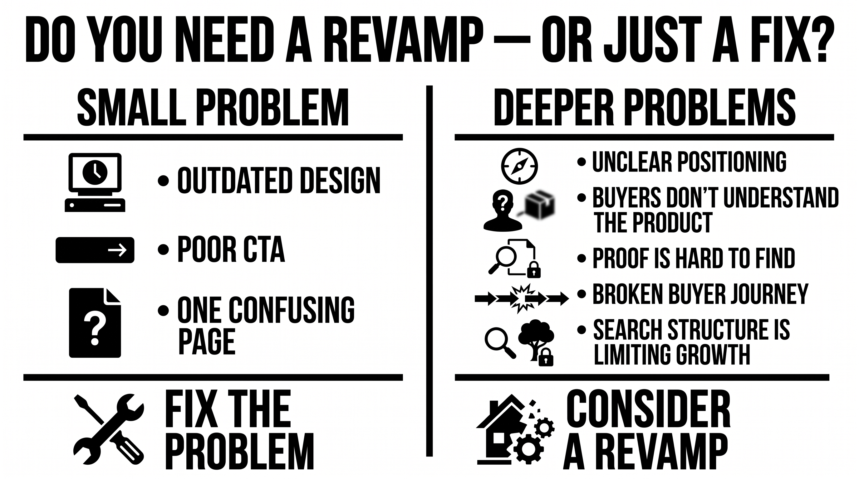
So, does your website actually need a revamp?
Maybe.
But “it looks old” is not enough information.
A broader revamp becomes more compelling when several deeper problems appear together.
The positioning no longer reflects the company.
Buyers struggle to understand the product.
Important proof is difficult to find.
The site no longer reflects how the company sells.
Marketing cannot evolve it efficiently.
Search architecture is limiting content growth.
The experience feels increasingly disconnected as new pages are added.
If the underlying problem is small, fix the small problem.
If it runs through the story, structure, experience, and technology, changing the wider system may make sense.
Just do not start with the homepage mockup.
Start with what the business needs the website to become.
Ready to rethink what your website is doing for the business?
Envizn Labs works with ambitious B2B tech companies across positioning, content and design direction, web design, Webflow development, SEO/AEO, AI workflows, and ongoing growth work.
Let’s talk growth.


Turn Your Vision into a Scalable Digital Experience
From brand to backend, we create systems and experiences that actually move the needle.

B2B Branding Strategies: 5 Ways to Build a Brand Buyers Remember
Webflow Website Maintenance: 7 Practices That Keep Your Site Working