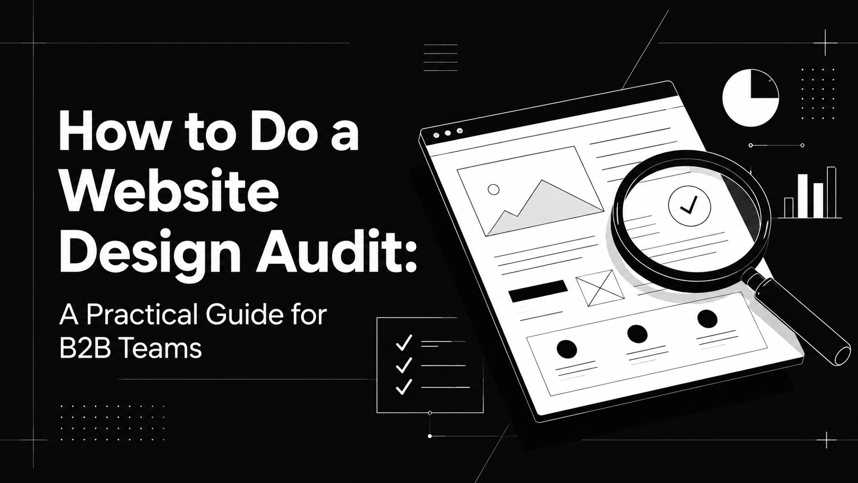
How to Do a Website Design Audit: A Practical Guide for B2B Teams
Your website can look polished and still underperform.
The branding feels consistent. The pages are responsive. The copy has gone through several rounds of edits. Yet visitors still struggle to understand the product, important pages lose attention, and the website generates fewer qualified conversations than expected.
The problem may not be one obvious design flaw. More often, it is a collection of smaller issues. Weak hierarchy, unclear messaging, inconsistent pages, buried proof, unnecessary friction, or a website that no longer reflects where the business is today.
That is exactly what a website design audit should uncover.
A good audit goes beyond asking whether a site looks modern. It examines how well the website communicates, guides visitors, builds trust and supports the business.
Here is how to do one properly.
What is a website design audit?
A website design audit is a structured review of a website's visual design, user experience, messaging, usability, responsiveness and overall effectiveness.
The goal is not to collect a long list of subjective design opinions.
It is to understand what helps visitors move forward, what creates friction and what needs to change.
For a B2B company, that means asking:
- Can a new visitor quickly understand what the company does?
- Does the website communicate why the product matters?
- Is important proof visible when buyers need reassurance?
- Does the page hierarchy guide visitors naturally?
- Does the website feel consistent across product, industry, case study and resource pages?
- Can visitors easily find their next step?
A useful website audit connects these observations to the buyer and the business rather than judging the website purely on aesthetics.
Why do you need a website design audit?
A redesign is expensive when you are redesigning the wrong things.
Before rebuilding a website, an audit helps separate symptoms from underlying problems.
1. Find the real reason the website is underperforming
"We need a better-looking website" is not always the real problem.
Maybe your positioning has changed but the homepage has not. Perhaps the navigation has become messy as new products were added. The design may be strong while the content hierarchy makes important information difficult to find.
An audit gives you a clearer picture of where the problems actually sit.
That makes design decisions easier to prioritize and less dependent on personal preference.
2. Make sure the website matches the business you are today
B2B companies evolve quickly.
Products expand. New use cases appear. Customer profiles change. Teams move upmarket. Messaging gets added page by page until the website becomes a record of several versions of the company.
Eventually, the website stops telling one coherent story.
A design audit helps identify where the current experience has fallen behind the business.
This matters particularly when a company has grown but its website still communicates like an earlier-stage business.
3. Improve the website without automatically rebuilding everything
Not every website problem requires a complete redesign.
Sometimes a better hero message, clearer navigation, stronger proof, improved page hierarchy or more obvious calls to action can materially improve the experience.
An audit shows which areas deserve significant attention and which can be improved with smaller changes.
The objective is not to redesign as much as possible. It is to change what needs changing.
How to do a website design audit
A useful design audit moves from understanding the business to examining the actual website experience.
Here is a practical process.
1. Understand the product and the buyer first
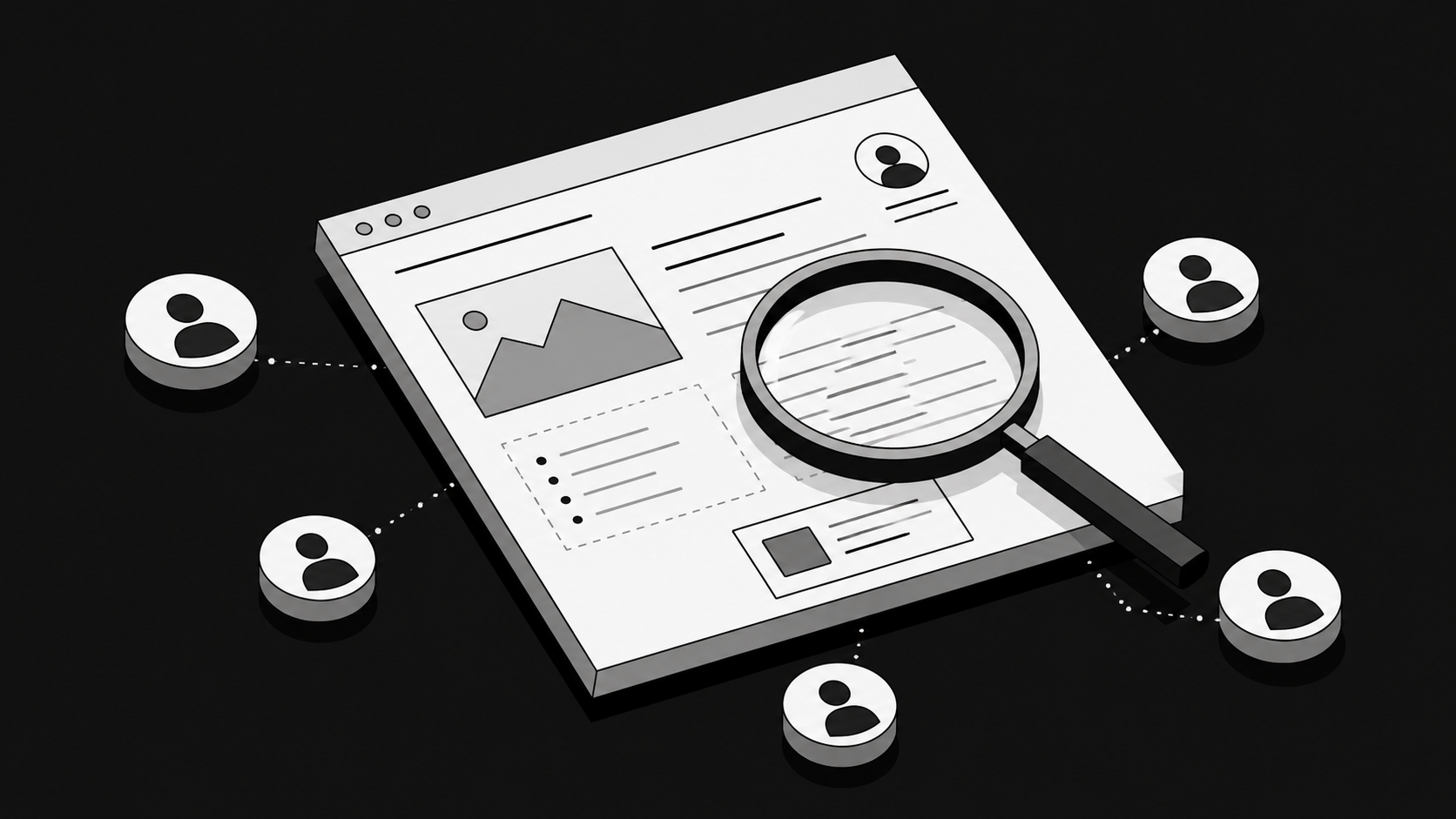
Do not start with colors, typography or spacing. Start with the business.
A website only works when it communicates the right information to the right people. Without understanding those people, design decisions become guesswork.
At Envizn Labs, website strategy begins with the business, the buyer, positioning, and a page-by-page understanding of what the website needs to say, prove and do before full design begins.
Before reviewing the interface, answer questions such as:
- Who are the primary buyers?
- What problem brings them to the website?
- How much do they already understand about the category?
- What questions usually come up during sales conversations?
- What objections prevent deals from moving forward?
- Which product capabilities matter most to customers?
- What makes the company meaningfully different?
- Has the business changed since the current website was created?
Talk to sales, marketing, product and customer-facing teams.
Customer interviews, sales-call notes, support conversations and feedback can often tell you more about the website's messaging problems than staring at the homepage for another afternoon.
2. Review what is already working
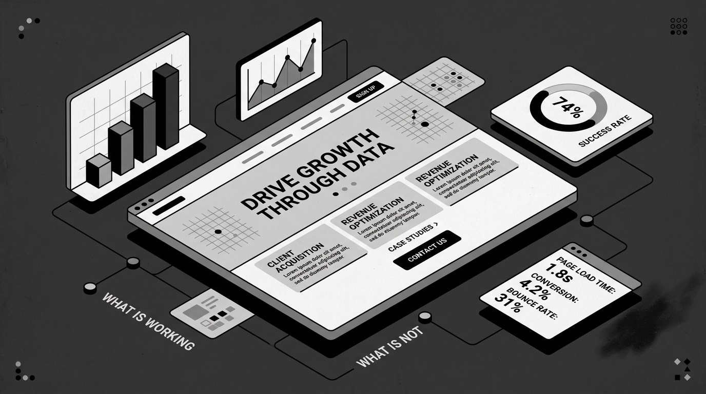
Do not assume the current website is entirely broken.
Before changing anything, identify what visitors already respond to.
Look at your analytics and determine:
- Which pages receive the most traffic?
- Where do visitors enter the website?
- Which pages generate conversions?
- Which important pages have unusually high exits?
- How far are people scrolling?
- Which calls to action receive engagement?
- Which pages keep visitors engaged?
- Are certain traffic sources behaving differently?
Analytics tell you what is happening.
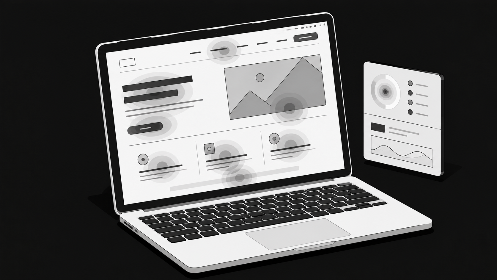
Behavioral tools such as heatmaps and session recordings can help you understand how visitors interact with the experience.
Perhaps visitors consistently ignore an important section. Maybe they click an element that does not appear clickable. Or they repeatedly reach a pricing, product or case-study page and then stop.
The objective is not to chase every metric. It is to identify patterns that help explain where the current experience succeeds or fails.
3. Perform a UX audit
Next, move through the website as though you are encountering the company for the first time.
Ignore what you already know about the business.
Can you understand the homepage without internal context?
Can you predict where navigation items will lead?
Does each page have a clear purpose?
Is important information presented in a logical order?
Does the next action feel obvious?
For B2B websites, pay particular attention to information hierarchy.
A technically complex product often needs a deliberate sequence. What is this? Who is it for? Why does it matter? How does it work? Why should I believe you? What should I do next?
If those answers arrive in the wrong order, even excellent copy and visual design can struggle.
Audit pages individually, but review the journey between them, too.
A homepage may work well in isolation while sending visitors into poorly structured product pages. A strong landing page may lead to a demo form that introduces unnecessary friction.
Good UX is about the complete path, not individual screenshots.
4. Review the visual design
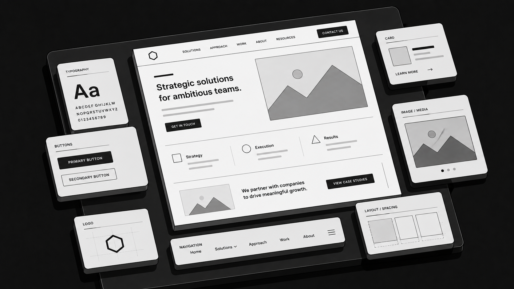
Once you understand the underlying experience, examine how effectively the visual system supports it.
Review:
- Typography
- Color usage
- Spacing
- Layout
- Imagery
- Product visuals
- Icons
- Buttons
- Cards
- Forms
- Illustrations
- Interaction patterns
- Overall consistency
The question is not simply whether the design looks good.
Ask whether the design communicates the right qualities.
A company selling complex enterprise technology may need to communicate confidence and clarity. An emerging category may require more visual explanation. A product with an unfamiliar workflow may benefit from interface demonstrations or diagrams instead of abstract graphics.
Also check whether design and copy are helping each other.
Important claims should look important. Supporting detail should not compete with the primary message. Proof should appear where skepticism naturally arises. Visual hierarchy should make the page easier to understand, not simply more interesting to look at.
5. Audit the website's messaging
Design and messaging are difficult to separate on a B2B website.
A page can have excellent visual hierarchy and still fail because the message itself is vague.
Read the website without looking at the visuals for a moment.
Does the homepage clearly explain what the company does?
Are headlines specific or filled with broad category language?
Do product pages explain outcomes as well as features?
Is there evidence behind important claims?
Are customer problems described in language buyers actually recognize?
Has internal terminology leaked into customer-facing copy?
One particularly useful test is simple. Could a qualified buyer explain what your company does after viewing the homepage for a short period of time?
If not, changing typography is unlikely to solve the problem.
The website needs a clearer story.
6. Check responsive design and accessibility
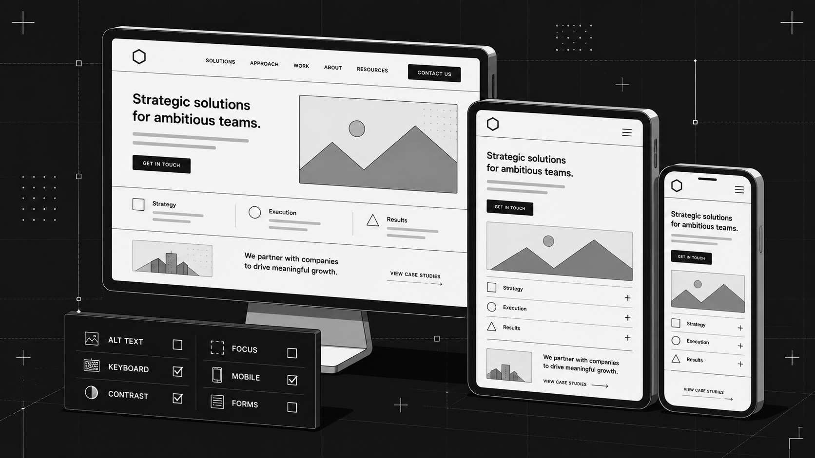
Your audit should not stop at desktop.
Review important pages across common screen sizes and pay attention to how the experience changes.
Look for:
- Overly long mobile sections
- Broken layouts
- Text that becomes difficult to read
- Buttons that are difficult to interact with
- Crowded navigation
- Oversized animations
- Images that lose their meaning
- Content appearing in the wrong order
- Horizontal scrolling
- Forms that become frustrating to complete
Responsive design should involve more than shrinking desktop layouts.
Sometimes mobile requires simplifying a visual, changing content order, or removing an interaction that no longer improves the experience.
Accessibility deserves attention, too.
Check basics such as readable contrast, keyboard navigation, descriptive image alternatives, logical heading structure, visible focus states, understandable form labels, and interactive elements that are usable without relying entirely on visual cues.
These checks make the site stronger for a wider range of users while often improving general usability at the same time.
7. Review the entire website, not just the homepage
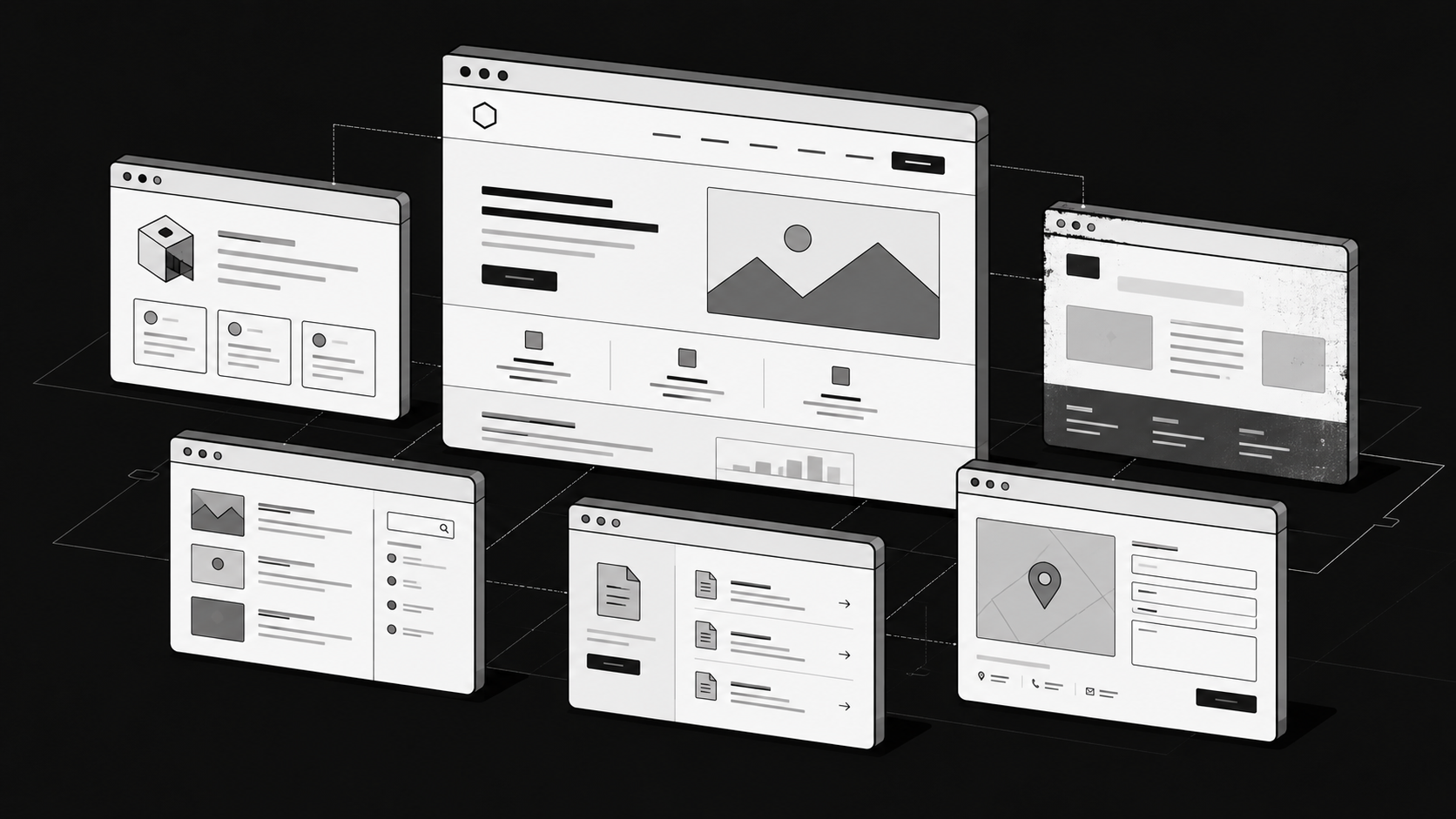
The homepage usually receives the most design attention.
Your visitors do not always start there.
Someone may discover you through a blog article. Another buyer might enter through a product page found in search. A prospect could receive a case study directly from a salesperson.
That means secondary pages need the same level of coherence as the homepage.
Audit:
- Product pages
- Solution pages
- Industry pages
- Case studies
- About pages
- Pricing pages
- Landing pages
- Blog templates
- Resource pages
- Contact and demo pages
Look for places where older layouts, outdated messaging, inconsistent components or broken journeys make the website feel like several different sites stitched together.
Consistency matters because every page contributes to the buyer's perception of the company.
8. Turn the audit into a prioritized strategy
An audit is only useful if something happens afterwards.
Avoid ending with a giant document containing dozens of observations and no indication of what matters most.
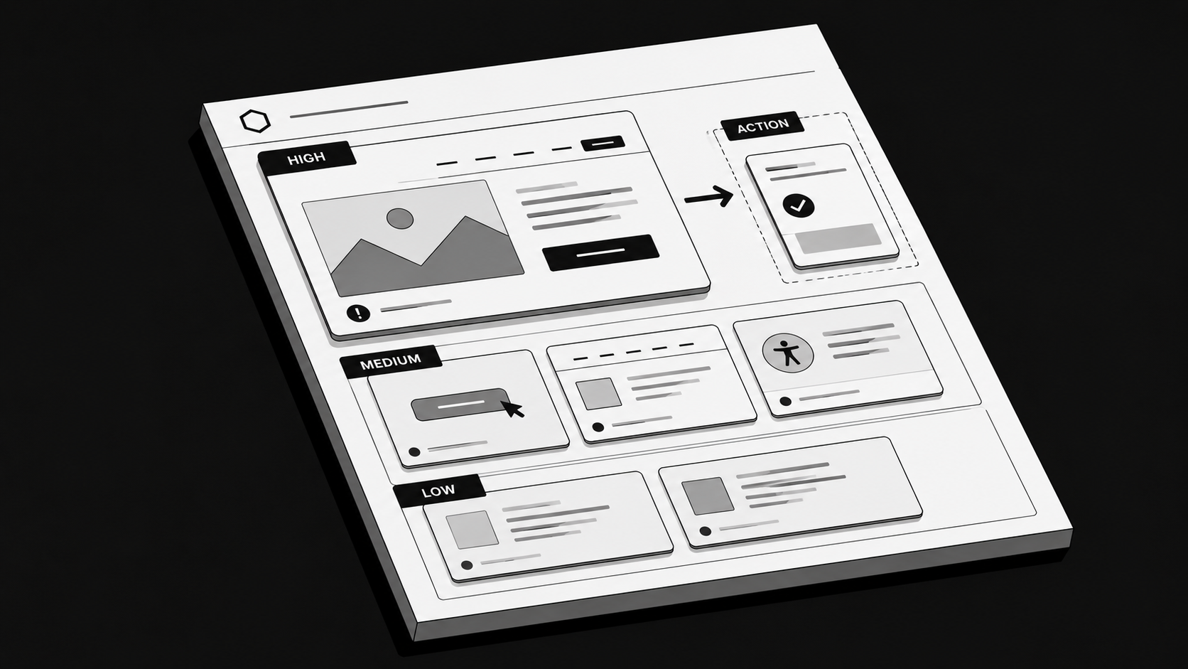
Group findings by potential impact. You might use categories such as:
- High priority: issues affecting comprehension, conversion paths, accessibility, positioning or critical pages
- Medium priority: improvements that strengthen consistency, usability or communication but are not currently blocking important journeys
- Low priority: cosmetic refinements and smaller opportunities that can wait
Then connect every recommendation to a reason.
Instead of "redesign the hero," write "clarify the hero so first-time visitors can understand the product, target customer and primary value before moving deeper into the page."
Instead of "add more visual elements," write "replace the abstract graphic with a product-focused visual that helps buyers understand how the workflow operates."
The more specific the reasoning, the easier it becomes to decide what should actually be implemented.
3 website design audit mistakes to avoid
Even a thorough audit can become unhelpful when it focuses on the wrong things.
Here are three common mistakes.
1. Auditing based on opinion instead of evidence
Design conversations can quickly turn into personal preferences. "I do not like this color." "This section feels old." "I think we should move this higher."
Those comments may point to real problems, but they are not enough on their own.
Combine qualitative observations with customer knowledge, analytics, business goals and behavioral evidence wherever possible.
The purpose of an audit is not to create a list of things somebody dislikes.
It is to identify issues that affect how effectively the website performs its job.
2. Copying another company's website
Reference sites can be useful. Copying their decisions is not.
A website designed for an enterprise software company with several product lines has different requirements from one designed for a startup still explaining a new category.
Different buyers need different information. Different products require different amounts of explanation. Different businesses need different conversion paths.
Use other websites to understand possibilities, not as templates for your own strategy.
Your audit should be based on your positioning, customers, website data, product and business goals.
3. Focusing only on the most visible pages
It is easy to polish the homepage while ignoring everything underneath it.
That creates a strong first impression followed by an inconsistent experience.
A visitor who moves from a carefully designed homepage to an outdated case study, confusing product page or poorly structured form experiences the whole journey, not your design team's prioritization.
Audit the website as a connected system.
The weakest important page can matter as much as the strongest one.
Conclusion
A website design audit should give you more than a collection of visual recommendations.
Done properly, it reveals where the website creates clarity, where it creates friction, and where the experience no longer reflects the business behind it.
Start with the buyer and the product. Understand what is already working. Review UX, visual design, messaging, responsive behavior, accessibility and secondary pages. Then prioritize the findings by impact instead of redesigning everything at once.
For ambitious B2B companies, the goal is not simply to make the website look newer.
It is to create a website that explains the business more clearly, earns trust more effectively, and gives marketing and sales a stronger asset to work with. Envizn Labs approaches websites with that broader role in mind, combining positioning, content and design direction, Webflow development, SEO and AEO, and ongoing growth work rather than treating the site as a cosmetic exercise.
A good audit tells you what needs to change.
A great one tells you why.
FAQs
When should you perform a website design audit?
A design audit is worth considering when your company has changed significantly, conversions are underperforming, the website has become inconsistent, you are planning a redesign, or important pages no longer represent the product and positioning accurately.
You do not need to wait until the website is obviously broken. Auditing before a major redesign can help ensure you preserve what works instead of rebuilding everything from scratch.
What is the difference between a website design audit and a UX audit?
A UX audit focuses primarily on usability and how people move through and interact with the website.
A broader website design audit also considers visual identity, messaging, hierarchy, responsiveness, consistency, and how effectively the complete experience represents the business.
UX is therefore an important part of the design audit rather than the entire audit itself.
What should a website design audit include?
A useful website design audit should cover:
- Business and audience context
- Website analytics
- User journeys
- Navigation and information architecture
- Messaging and content hierarchy
- Visual design
- Conversion paths
- Responsive behavior
- Accessibility
- Secondary pages
- Prioritized recommendations
The final output should make it clear what is working, what needs improvement, and which changes deserve attention first.


Turn Your Vision into a Scalable Digital Experience
From brand to backend, we create systems and experiences that actually move the needle.
How to Choose the Best Webflow Agency for Your B2B Website

B2B Branding Strategies: 5 Ways to Build a Brand Buyers Remember