Most B2B Website Redesigns Change the Pixels, Not the Story
There's a question every buyer asks us silently and almost nobody says out loud.
Will this actually get us more qualified conversations, or is it a paint job?
It's a fair question. It's also the right one, and the fact that it goes unspoken is a big part of the reason B2B website redesigns keep failing.
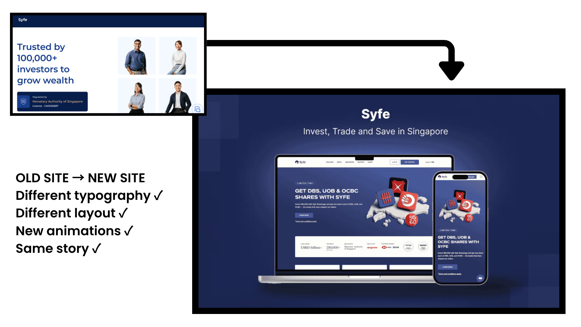
Here's the pattern we run into more than any other. A company comes to us wanting a redesign. We look at the current site. It's fine. It's clean, it's responsive, it loads fast, and somebody clearly cared about the typography. Then we ask when it was last rebuilt, and the answer is eighteen months ago. Sometimes less.
So they already did this. They hired someone, spent the money, shipped a new site, and eighteen months later they're back with the same feeling that something isn't working.
The design was never the problem. The positioning was, and nobody touched it.
The redesign that changes everything except what the site says
Walk through how a typical B2B website redesign actually happens.
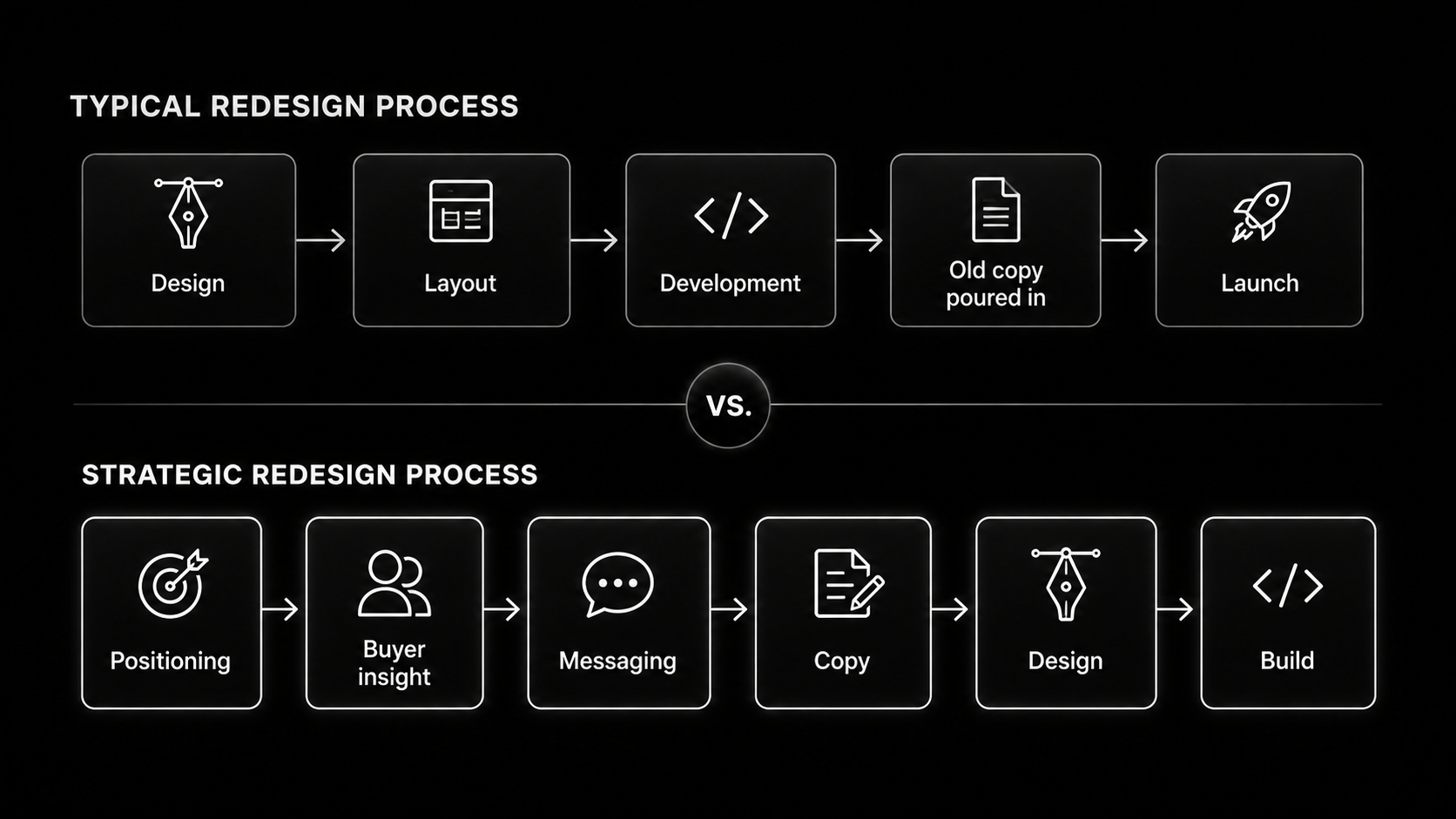
Marketing decides the site looks dated. A vendor gets hired. The vendor asks for brand guidelines, a sitemap, and any existing copy. Somebody exports the current pages into a doc. Design comes back, and it’s better. Cleaner grid, better spacing, an animation on the hero that everyone likes in the review call.
Then the copy gets poured in. Mostly the old copy, lightly edited, because rewriting it would mean reopening arguments nobody wants to reopen. The site ships. It looks like a 2026 website instead of a 2023 website.
And the message is identical. The homepage still leads with the same three feature pillars. The about page still says the same thing about the team’s combined years of experience. The case studies still describe what was built rather than what changed.
You redesigned the container. The thing inside it never moved.
Nobody owns the website
This keeps happening for a structural reason, not a taste reason.
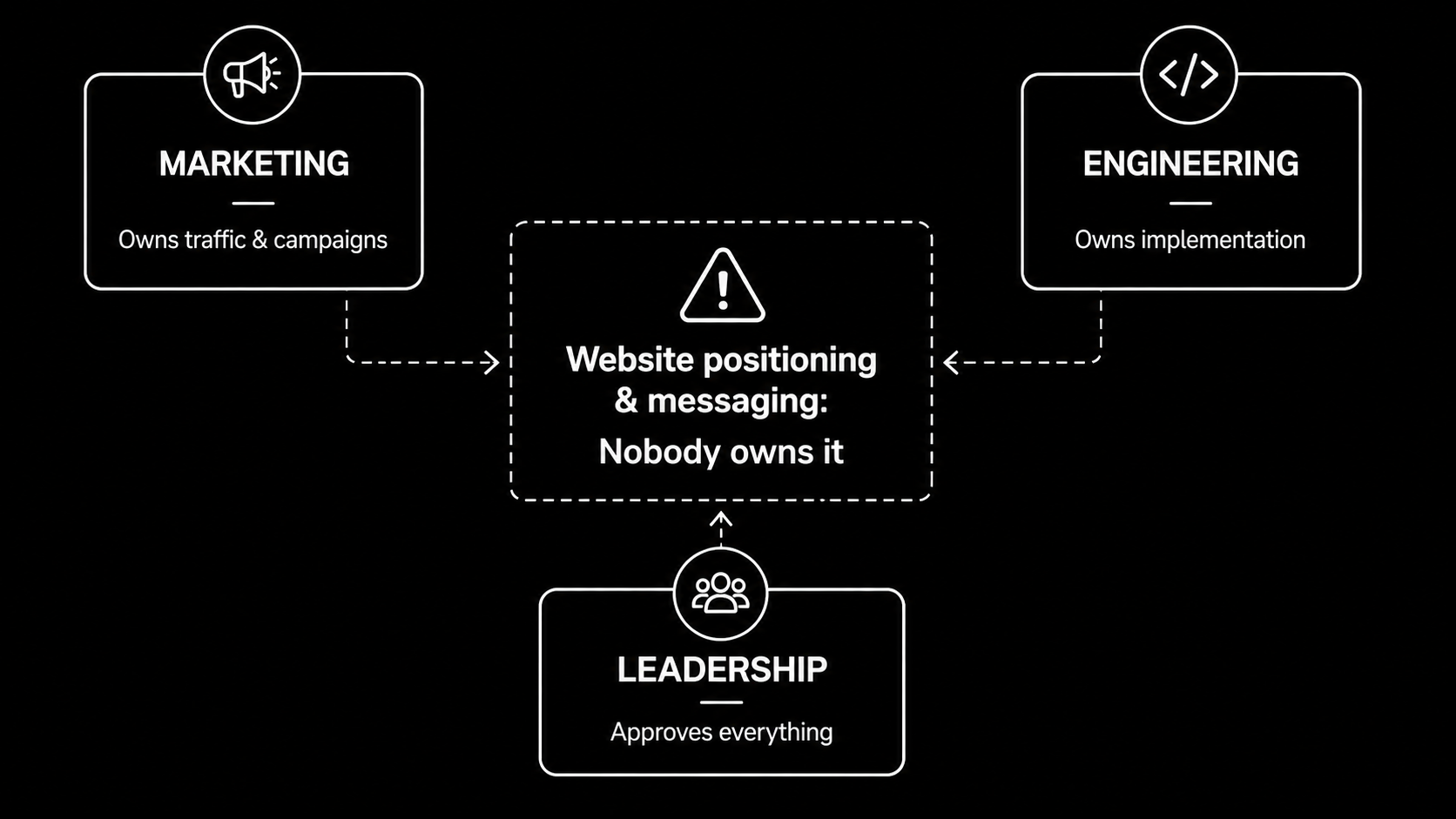
Marketing wants the website. Engineering builds it or manages whoever builds it. Neither one is accountable for what it says. So the site becomes a negotiated artifact, assembled from whatever each team can agree to, and the parts that would require a hard decision get softened until they’re safe.
Safe copy is the most expensive thing on a B2B website. It costs you nothing to write, and it costs you every buyer who couldn’t tell you apart from the last three tabs they had open.
You can see the result most clearly in categories where everyone has independently arrived at the same website.
Look at sell-side M&A advisory. Navy blue. A handshake or a skyline. Trusted advisor to middle-market founders since 1998. A team page of headshots against grey. A contact form. Every firm in the category has built the same site, and collectively they’ve trained themselves into invisibility. A founder comparing three advisors cannot distinguish them, so they default to whoever a friend mentioned.
SaaS does its own version. Most SaaS websites are written for people who already understand the product, which is to say they’re written for the people who built it. They lead with features because the product team wrote the outline. The buyer who’s never heard of the category arrives, reads three lines about unified workflow orchestration, and leaves.
Neither problem is fixed by a redesign. Both survive one comfortably.
How to tell which problem you have
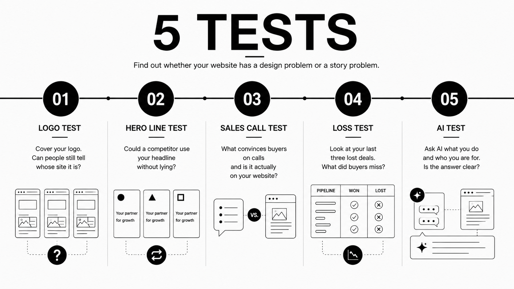
Before you commission anything, run these tests. They take an afternoon, and they’ll tell you whether you need a designer or a decision.
- The logo test. Screenshot your homepage. Cover the logo. Show it to someone who knows your category and ask whose site it is. If they can’t tell, and if you couldn’t tell with three competitors’ homepages either, you don’t have a design problem.
- The hero line test. Read your headline and ask whether a competitor could put it on their site without lying. If they could, it isn’t positioning. It’s a description of your category.
- The sales call test. Ask whoever runs your sales calls what they say in the first ten minutes that convinces people. Then find that on your website. Usually, it isn’t there because the thing that actually persuades buyers was discovered on calls and never made it back into the site.
- The loss test. Pull your last three lost deals. Ask why. If the answer is that the buyer didn’t understand what you did or went with someone who seemed more specialised, that’s a story problem wearing a design costume.
- The AI test. Ask ChatGPT what your company does and who it’s for. Most teams have never done this. Your buyers already have. If the answer is vague or wrong, your site isn’t communicating clearly enough for a machine to summarise it, which means it probably isn’t clear enough for a distracted human either.
None of these require a vendor. All of them will tell you more than a redesign brief.
Fix the story first, then design it
The order matters more than the execution.
When we take on a redesign, positioning comes before anything visual. We determine what makes this company the obvious choice and what each page needs to say, prove, and do. Copy gets drafted from that. Design direction gets approved before full design begins, so nobody discovers a fundamental problem in week five when the pages are already built.
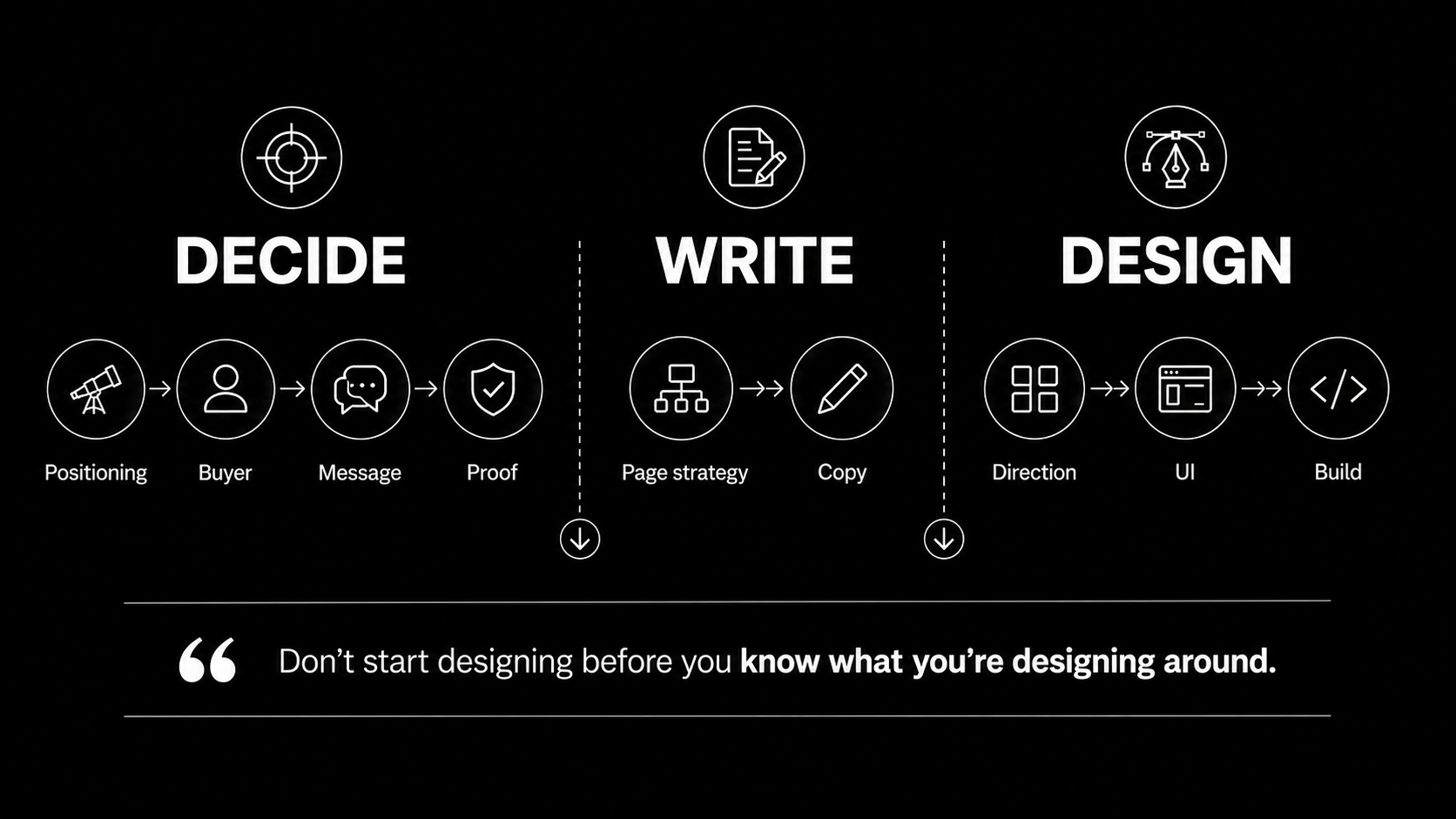
That sequence sounds obvious written down. It’s the reverse of how most redesigns run, where design is commissioned first and words get fitted to the layout afterwards.
Here’s what it looks like when the story leads.
Stone Canyon Advisors
Stone Canyon is a boutique M&A advisory helping middle-market founders prepare for exits. The category problem described above is exactly their problem.
The insight that shaped the project wasn’t visual. It was about the buyer. A founder considering an exit is doing quiet, slightly embarrassed research at eleven at night. They are not ready to be sold to. They are certainly not filling in a form that says let’s talk about your business, because talking about it makes it real, and they haven’t decided anything yet.
A brochure site asks that person to identify themselves before they’ve worked out what they want. Most of them won’t.
So we built the site around a 75-point Acquirable Score: a private self-assessment that gives an owner a readiness score and an actionable roadmap. It answers the question they actually have at 11pm, which is am I even ready, and it does it without requiring them to talk to anyone.
That’s a positioning decision. The design serves it. Reverse the order and you get another navy website with a nicer grid.

Zenith Labs
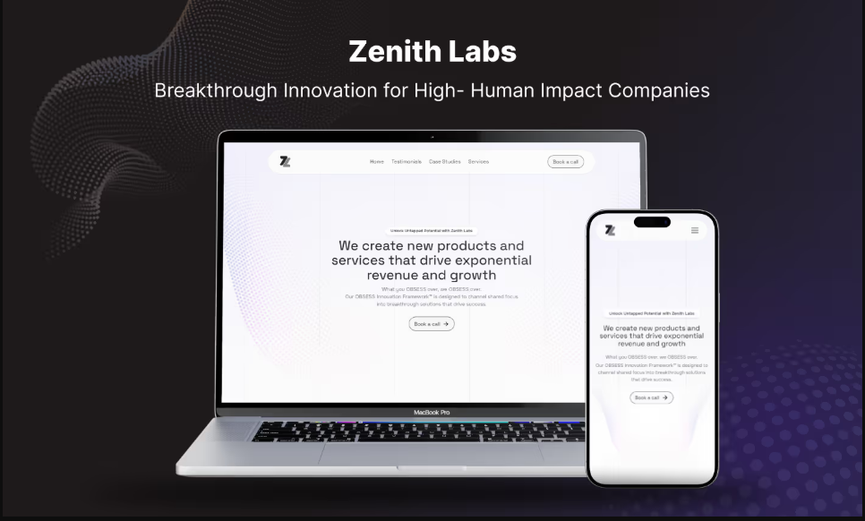
We built Zenith Labs’ Future-proof tool alongside their site and their UI/UX. Different category, same principle. The interactive asset isn’t decoration on top of the marketing site. It’s the part of the site that does work.
Two of these matter more than one. A single assessment tool looks like a clever one-off. Two make it a way of thinking about what a website is for.
BEI Advisors
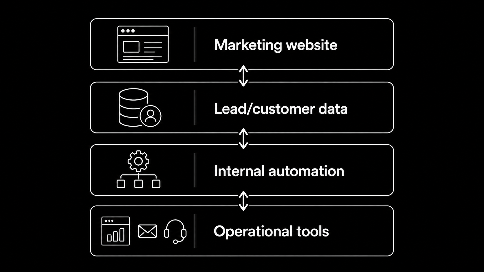
With BEI Advisors, the marketing website got a full UI design and development overhaul, and we also built custom automation and internal tools to streamline how they operate.
That combination is worth noticing. The website and the operational tooling behind it were treated as one problem rather than two purchases. Most redesigns can’t reach that far because the vendor was hired to produce pages.
Oddr
Oddr is an AI-driven revenue intelligence platform for law firms. We delivered end-to-end UI/UX design, development, and visual assets, and it ran under a hard deadline. Their co-founder and CTO, Sumit Garg, describes it on camera as a rebrand and website revamp delivered fast, and says the quality has held since launch.
Speed and story aren’t opposites. What kills timelines isn’t ambition about the message. It’s discovering in week five that the message was never settled.
AppFaktors and TrueFoundry
Two examples of what happens after launch, which is the part of a redesign nobody plans for.
AppFaktors brought us in for their website. Then they handed over the frontend of their core product. Brian Krug, their CEO, says so on camera. TrueFoundry moved from the initial build to ongoing monthly work. Innovaccer became an ongoing enterprise management engagement for their Webflow site.
That pattern is the honest argument against treating a redesign as a one-time capital expense. The site is not a deliverable you receive and file. It’s the thing your buyers use to decide about you continuously, and it decays the moment your positioning moves and the site doesn’t follow.
What this means for website redesign cost
Most redesign budgets are built as if design is the expensive part. Design is the visible part. It isn’t usually the part that determines whether the project works.
If you spend the entire budget on visual execution and none of it on deciding what the site should say, you’ll get a better-looking version of the site you already have. Eighteen months later, you’ll feel the same itch, and the second redesign will cost as much as the first.
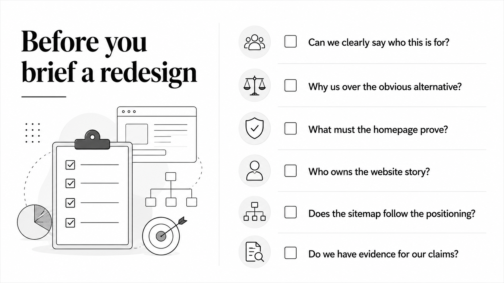
The cheapest thing you can do before spending anything is answer three questions honestly. Who is this for? Why us over the obvious alternative? What do we need this page to prove? If your team can’t answer those questions in a room, no vendor can answer them in a mockup.
Before you brief a redesign
A short list, in order.
- Run the five tests above. Write down what you find.
- Decide who owns the website. One person should be accountable for what it says, not just whether it ships.
- Settle the positioning before the sitemap. The sitemap is a consequence of the positioning, not an input to it.
- Identify what each page has to prove and what evidence you actually have to prove it. If the evidence doesn’t exist, that’s a business problem to solve before it’s a design problem to style.
- Then, and only then, talk about design.
If you get through that list and the answer is genuinely that your site is well-positioned and simply looks old, good. That’s a real design project. It’ll go quickly, and you’ll get what you paid for.
Most of the time, that isn’t the answer.
Conclusion
The redesign isn’t the strategy
A website redesign can fix how your company looks. It can’t fix uncertainty about what your company stands for, who it’s for, or why a buyer should choose you.
That work has to happen first.
Before you change the layout, rewrite the navigation, or start reviewing mockups, make sure the story is settled. Decide what each page needs to say, what it needs to prove, and who is responsible for keeping that message clear as the company changes. That’s the difference between a website that simply looks newer and one that actually helps buyers make a decision.
Because the best redesign isn’t the one that changes the most pixels. It’s the one that makes the right story impossible to miss.


Turn Your Vision into a Scalable Digital Experience
From brand to backend, we create systems and experiences that actually move the needle.

B2B Branding Strategies: 5 Ways to Build a Brand Buyers Remember
Webflow Website Maintenance: 7 Practices That Keep Your Site Working